Skip to content

Ecommerce Design · 2026 · Wildkamp

Taking a 50-year-old brand digital first, without a rebuild

Design system, homepage, listing and product pages for a B2B webshop, designed for the platform it runs on today.

Ecommerce Design · Design System · B2B · Figma · Intershop

Wildkamp homepage on a tablet: the category menu, a hero about irrigation plans and the popular categories, over a dimmed collage of the new listing, product and content pages
Homepage. On top of the listing, product and content pages that followed it.
years of Wildkamp, a brand built offline
50+
kept, the rebuild is 1 to 2 years out
Intershop
a week, used as a working session
1 call
banner variants, on purpose
2

Wildkamp has supplied landscapers, farmers and installers in the Netherlands for more than 50 years. Irrigation, pumps, drainage, fittings. Most customers arrive knowing the article number. For them, the webshop is where they order.

The brand was built for an offline company and never caught up with the webshop. The shop runs on Intershop, and a headless rebuild is one to two years away. So the job was a digital-first house style for the platform Wildkamp has today, written down in a design system.

The brief

Jarola, the company behind Wildkamp, already knew me. I had designed for Wilweb, its newer Shopify shop, and they came back for Wildkamp because that went well. The same BTNG Design Subscription kept running for Wilweb alongside it: a registration form, the cart, email templates and a quick order list.

The brief came down to missing building blocks. No extended colour palette. No type hierarchy for screens. No set of components, so a button got used for whatever needed one. Phase 1 was polish within Intershop, scoped for two months. After the first round, Wildkamp’s digital lead emailed “We say: GO!” and it became the full redesign.

Three jobs and one platform

The briefing gave the site three jobs. Ordering, for the professional who already knows what they need. Soft conversions, like irrigation plans and custom quotes, which feed other departments and were hard to find. And information, in the knowledge centre.

Every screen also had to work in Intershop as it is, or come with a version that does.
From June

The design system

The design system lives in Wildkamp’s own Figma, split into a core file and a deliverables file. Wildkamp blue, yellow for the primary action and a white page. Museo for headings and the product name, Inter for the interface and every price.

Green marks stock and delivery, and it got a decision of its own. The first ramp turned fluorescent in the lighter steps. Green is not a Wildkamp brand colour, so I kept the base step and took the saturation out of everything lighter.

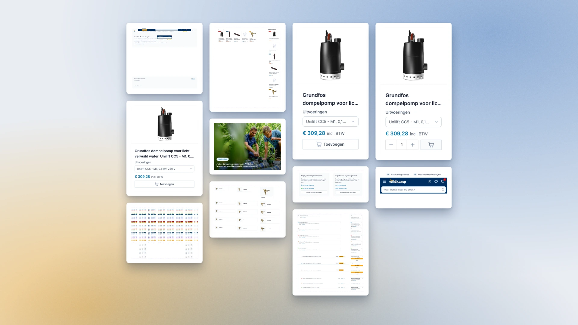
Wildkamp components: product cards with a variant picker, price and quantity, a table, a hero banner card, category lists and the mobile header with search
Components. Product cards, a table, a banner, category lists and the mobile header.

June

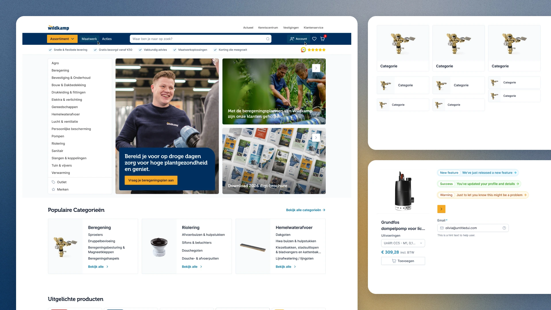
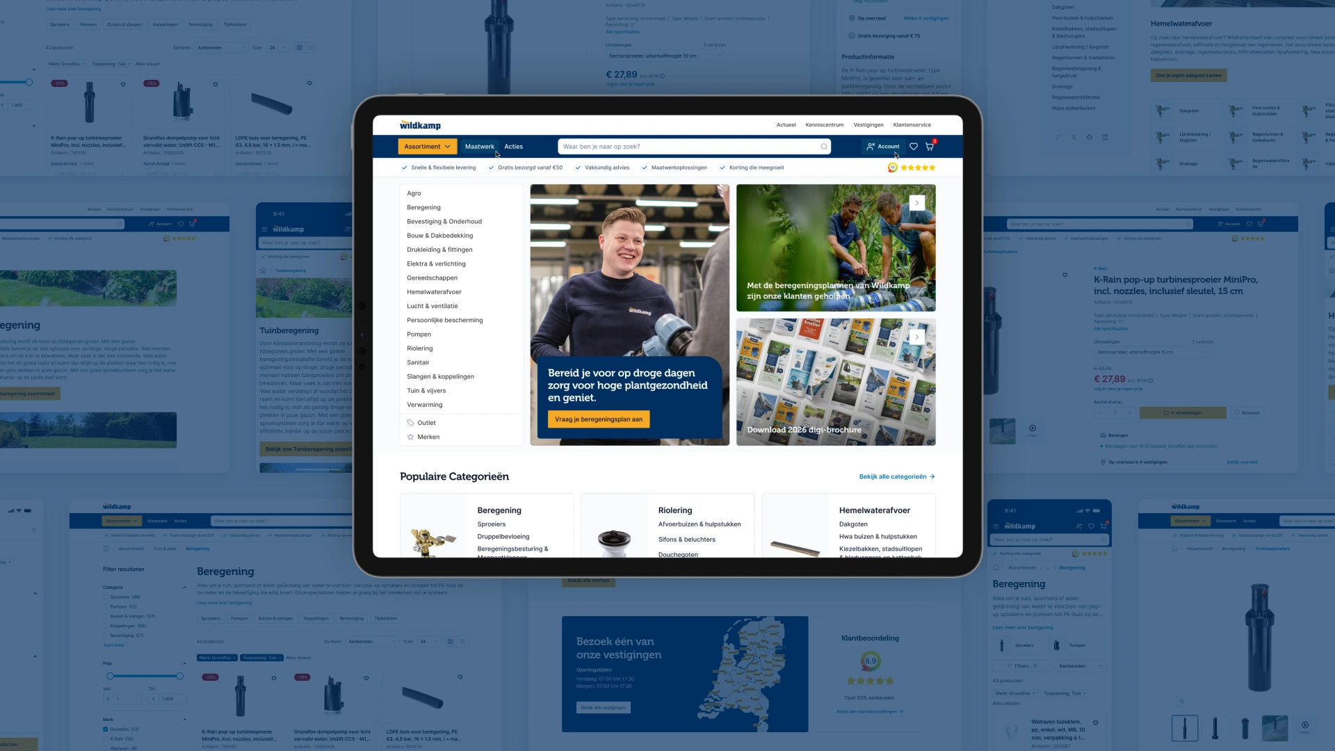
The homepage

The old homepage put every section in its own frame, on blue. The new one is white, with blue kept for the hero. The USP bar sits on white with one line under it, on every page, desktop and mobile.

Wildkamp’s banners show its own staff, heads at the top, so the text goes below the image on every banner. Popular categories became compact tiles: black titles, weight for emphasis, the photo filling the tile, and two lines before an ellipsis for names like “beregeningsbesturing en magneetkleppen”. Brands stayed out of the popular categories, as I advised, and got their own block lower on the page.

Wildkamp homepage with the category menu, two hero banners and the popular categories, next to the category tiles and a product card from the design system
Homepage. A white page, a blue hero, compact category tiles.

September

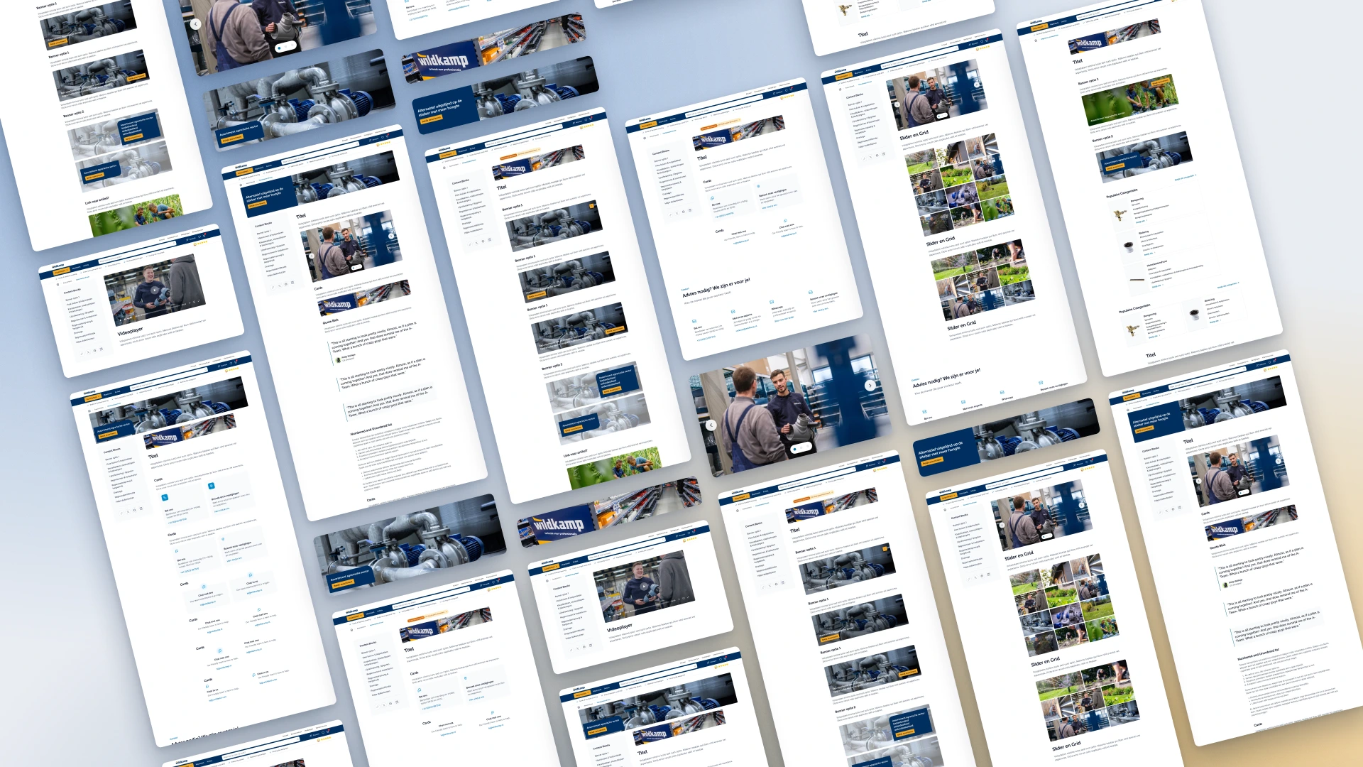
Blocks for the editors

Most of Wildkamp’s content and brand pages are put together by CMS editors. They got a library: banners, steps, a history timeline, quotes, lists, a table, alerts, a contact form, a compact FAQ and one header component with its options in the CMS.

Banners got exactly two variants: the block on the left with its rounded corner bottom right, or on the right with the corner top left. Wildkamp’s digital lead kept it at two, because more positions give whoever builds the page too much to choose from. The big testimonial carousel came out, because KIYOH already shows Wildkamp’s reviews.

A wall of Wildkamp content pages built from the new blocks: banners, steps, timelines, quotes, tables and forms
Content blocks. Banners, steps, timelines, quotes, tables and forms, put together as pages.

One real page

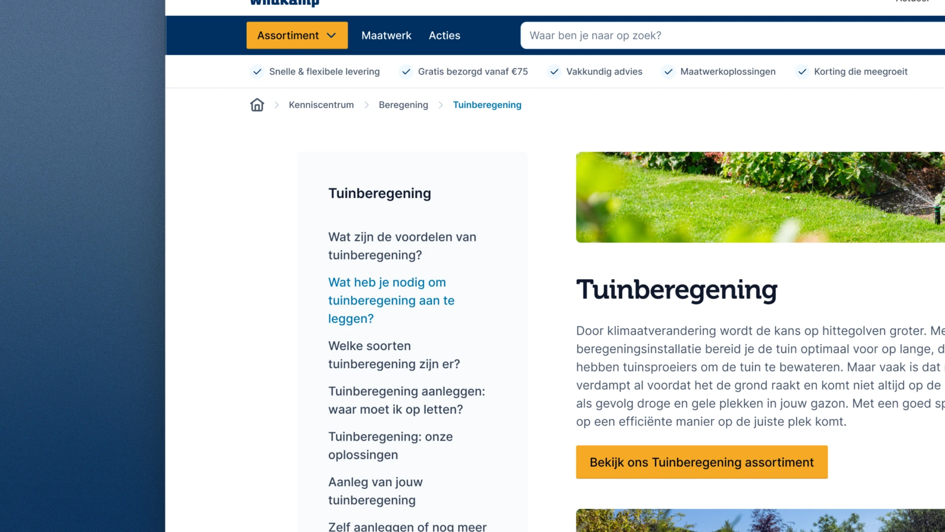
Components on a board don’t show whether a page holds together. So I rebuilt one existing page in the new style, tuinberegening, with a proper video player instead of a YouTube embed.

Tuinberegening page in the new style: a sidebar of questions about garden irrigation, a photo of a sprinkler on a lawn, and an intro with a button to the irrigation range
Tuinberegening. An existing page, rebuilt from the new blocks.

Forms, field by field

The custom-order form lost its sidebar, because one form has nothing to do with the next. Then every field got its own type. A dropdown with one option became a disabled field, one with two options became radio buttons, and a temperature range became a number field with plus and minus.

September

The listing

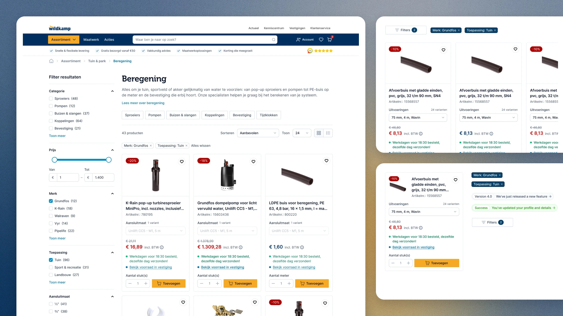
Product cards in grid and list view, with and without discount, each with stock, quantity and add to cart. Active filters show as chips above the results, with a price slider and an icon-only toggle between grid and list.

Beregening listing: filters on the left with a price slider and brand checkboxes, chips for the active filters, and product cards with discount labels, stock lines and a quantity field, next to cards in list view
Listing. Spaced cards, active filters as chips, quantity and add to cart on the card.

An Intershop-friendly version

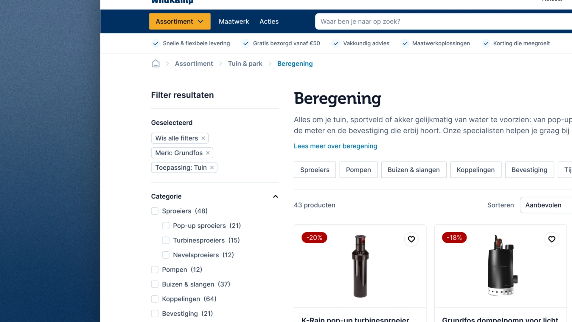
Wildkamp’s digital lead asked for a second version, closer to what Intershop does today: the active filters in the left sidebar, under “Geselecteerd”. Both went to development.

Intershop-friendly listing: the active filters Merk: Grundfos and Toepassing: Tuin listed in the sidebar under Geselecteerd, above the category filters
Intershop-friendly version. Active filters in the sidebar, where the current platform puts them.

October

The product page

The product page was left out of the original brief, because almost nothing on it could change in Intershop. Jarola asked for a proposal anyway.

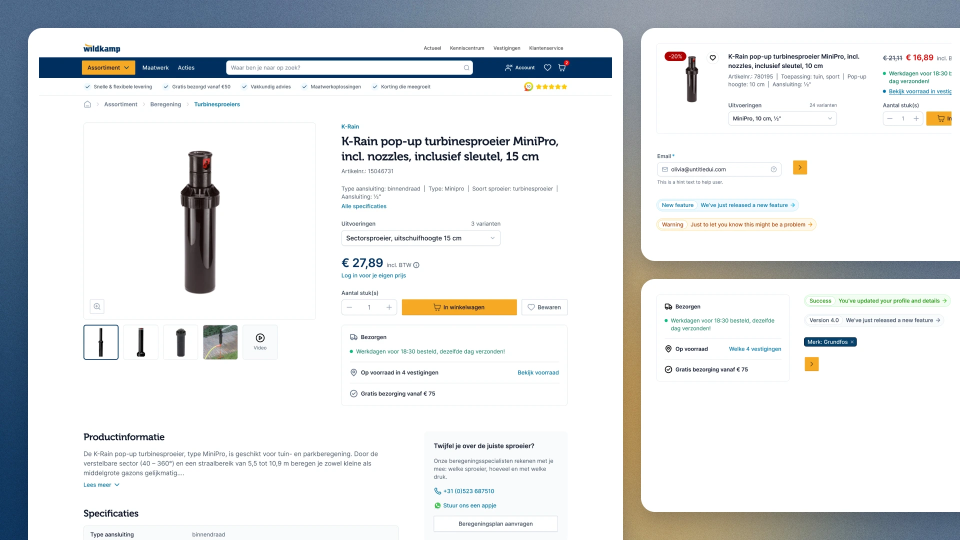
A big product photo and a calmer hierarchy. The product name in Museo, because it is the page title, and the price in Inter. Delivery and stock merged into one block, with the number of branches that have it in stock, and free delivery named separately.

K-Rain pop-up sprinkler product page: a large photo with thumbnails, the price, quantity and add to cart, and one block for delivery and stock in four branches, next to the product card, alerts and the delivery block as components
Product page. A big photo, one block for delivery and stock.

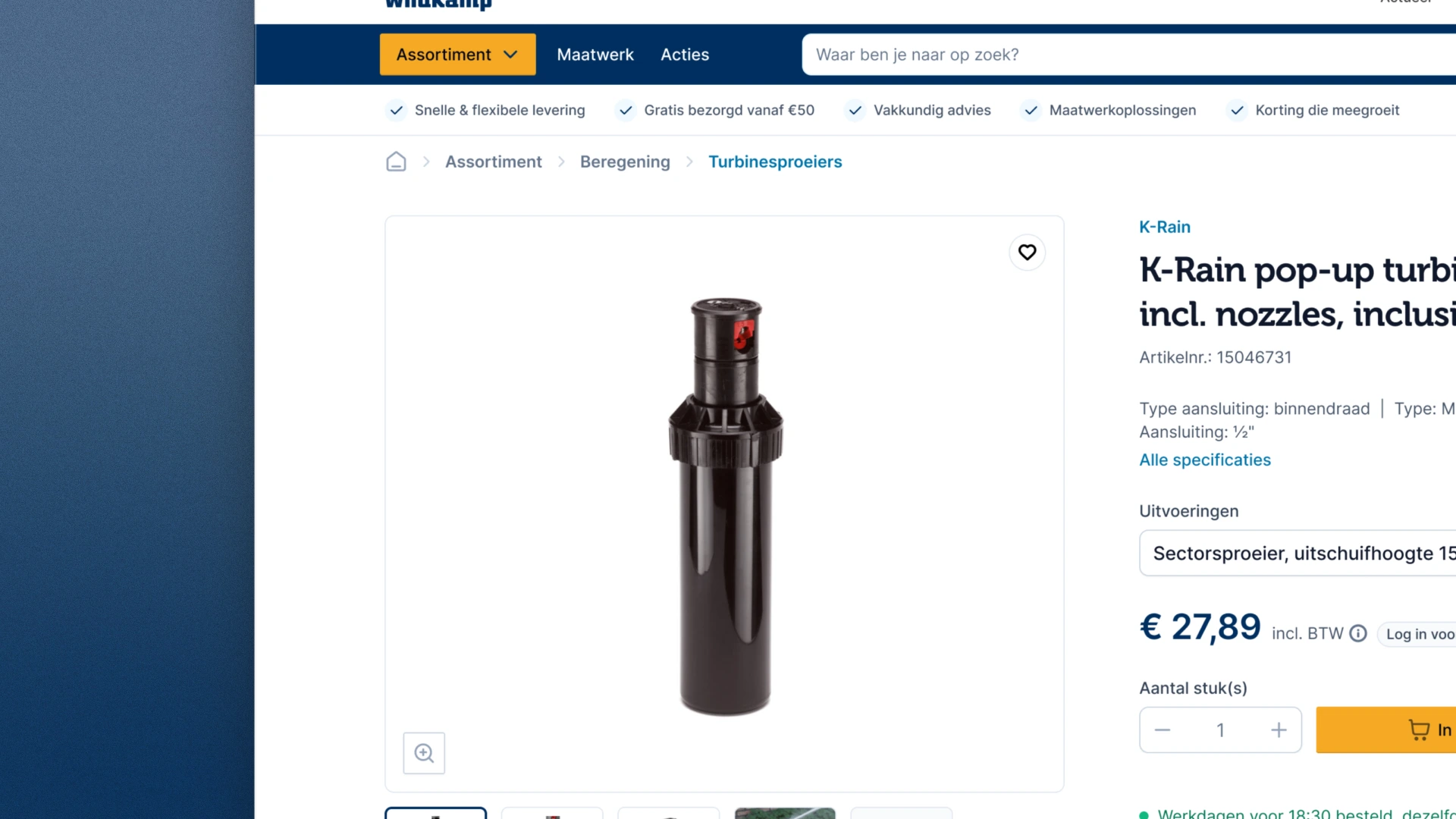
Every discount at Wildkamp sits behind the login. Jarola’s designer pointed out that “log in for your own price” was tucked away under the price, so I made it more prominent, right next to it.

Close-up of the product page: the price of €27.89 including VAT with a button to log in for your own price right beside it
Your own price. The login sits next to the price.

On a phone

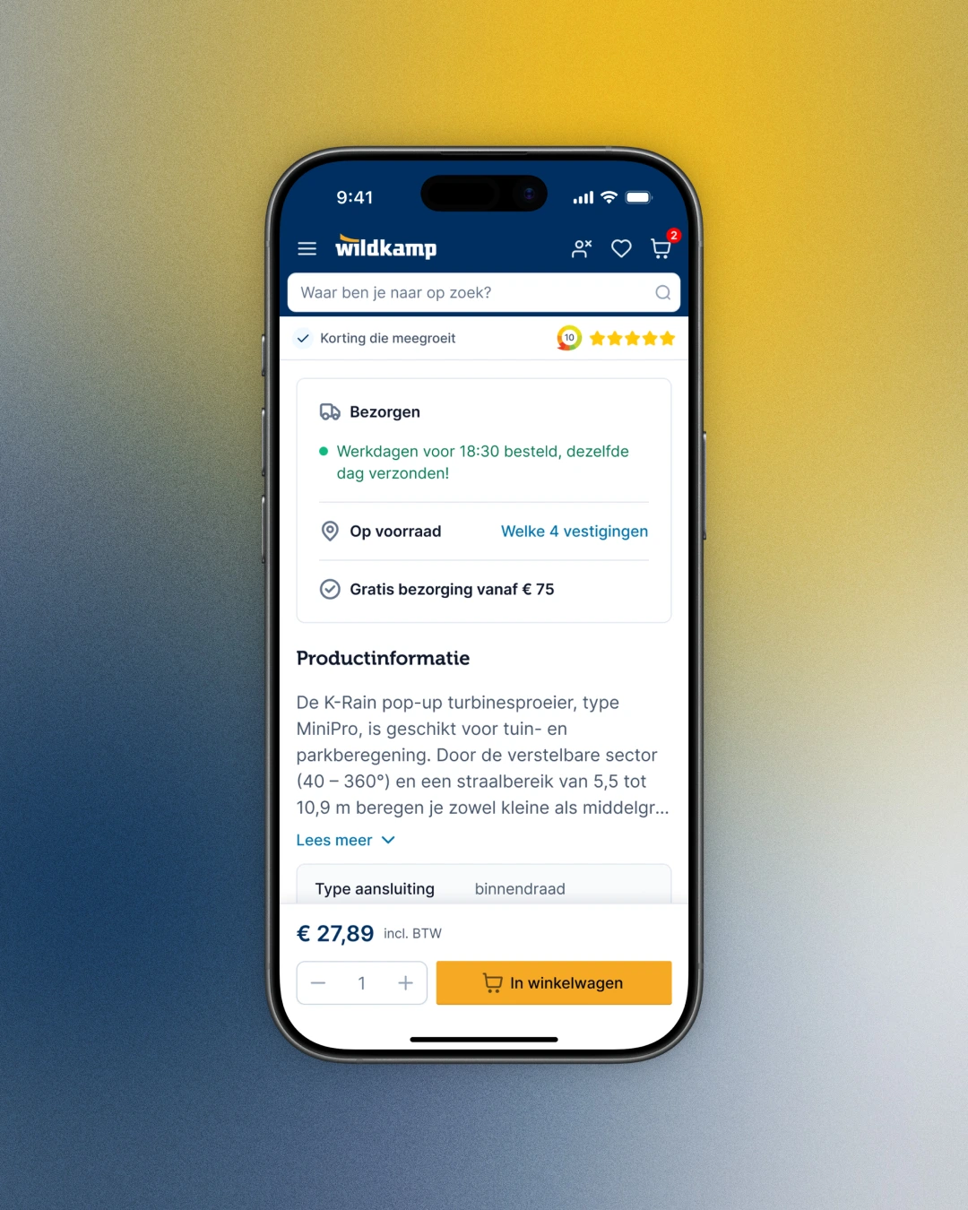
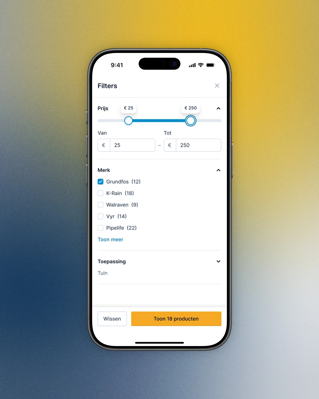
On mobile, quantity and add to cart stay pinned to the bottom of the product page. The filter sheet counts the results on its button before you close it.

Product page on a phone: delivery and stock in four branches, product information, and the price with quantity and add to cart pinned to the bottom
Product page on a phone. Quantity and add to cart stay at the bottom.
Filters on a phone: a price slider from €25 to €250, Grundfos ticked under brand, and a button that reads Toon 18 producten
Filters on a phone. The button counts the results before you apply.

How the work ran

One call a week, on Monday, with Wildkamp’s digital lead and Jarola’s designer. It was a working session: decisions made on the call, and the variants that lost archived so nobody builds them by mistake.

Between calls I sent recorded video walkthroughs, and before a call an email with the decisions I needed from them. Feedback came in as Figma comments. The two of them filtered everything before their developer wrote user stories. The listing and product page went to development in October.

What this shows

A redesign doesn’t have to wait for a new platform. Most of this was designed for Intershop as it is, and where that meant a compromise, like the filters, development got both versions.

The choices are written down in a design system, so the headless rebuild can start from a house style made for screens.

“We say: GO!”
Bas Kuipers Digital lead, Wildkamp, by email after the first round

Running a B2B webshop on a platform you can’t replace yet?

Book a call

Back to cases