
A branded WooCommerce cart and checkout for Wouter Kleinsman

Philip Wallage · Ecommerce Design · 2025
Wouter Kleinsman is a Dutch coach who also sells books on wouterkleinsman.nl.
I designed his website, his shop and the checkout. The checkout is the part this case is about. WooCommerce has a strong feature set for the cart. Out of the box it looked rough. I designed the cart and checkout in Wouter's brand: dark background, yellow button, and the same type and tone as the rest of the site.
- home, coaching, product and information pages, on desktop and mobile
- Website
- Wouter's books, workbook, journal and audiobook
- Shop
- cart and checkout in his brand, with iDeal, credit card and Klarna
- Checkout
Figma · WooCommerce · UX Design · UI Design
I designed the website, the shop and the checkout. A developer built them in WooCommerce from my designs.
Design: March to April 2025, two months of the Design Subscription, with one meeting a week.
What Wouter sells
Wouter calls himself the no-nonsense coach of the Netherlands. He coaches live on location in Hengelo. The two coaching offers go through an application form, so they never touch the cart.
The cart is for the shop. That is five books and products on /boeken/: “Fuck it, you can have it all”, “Zo word je een gamechanger”, The Workbook, the Gamechanger Journal and the Gamechanger Online Luisterboek. A shopper who gets this far already wants the thing, so the cart and checkout have one job: take the order without making them think.
The cart
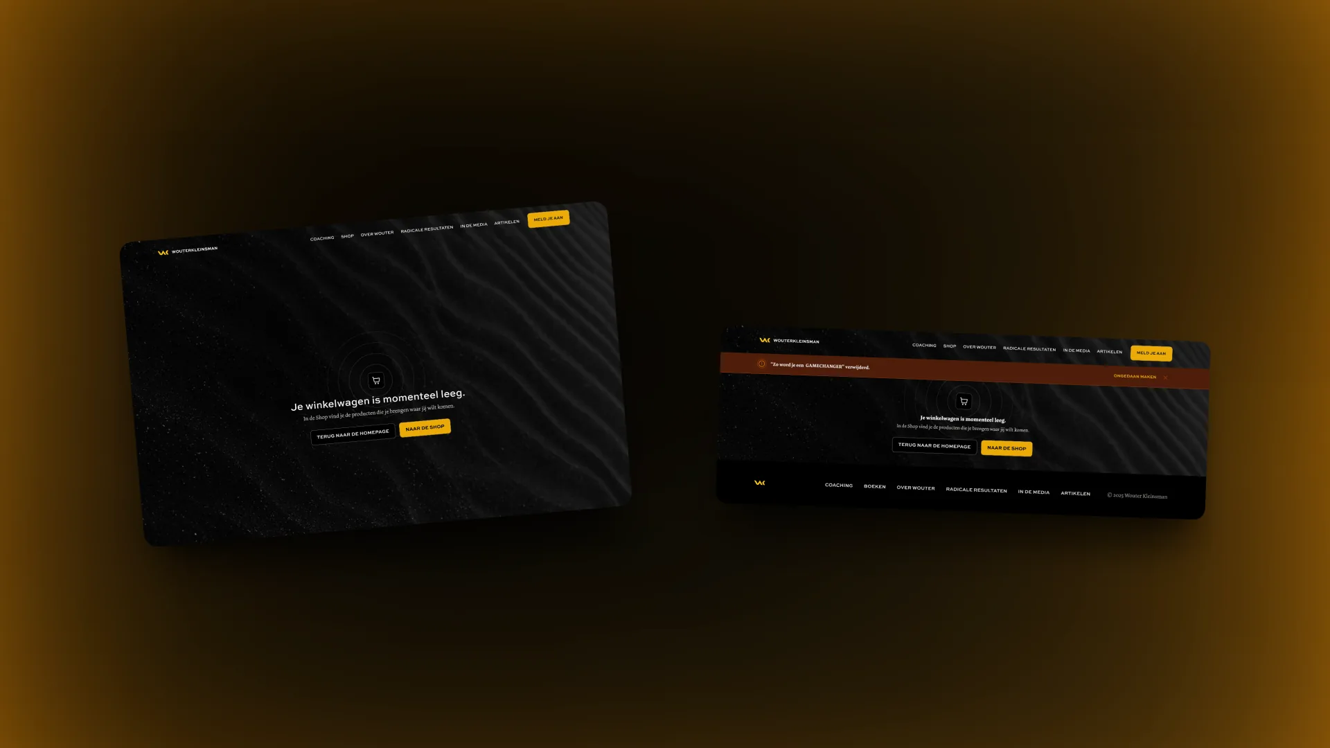
I designed five cart states. The empty cart sends people back to the shop. A removed item can be undone from an alert bar at the top. Adding an item and having several items each get a state of their own.
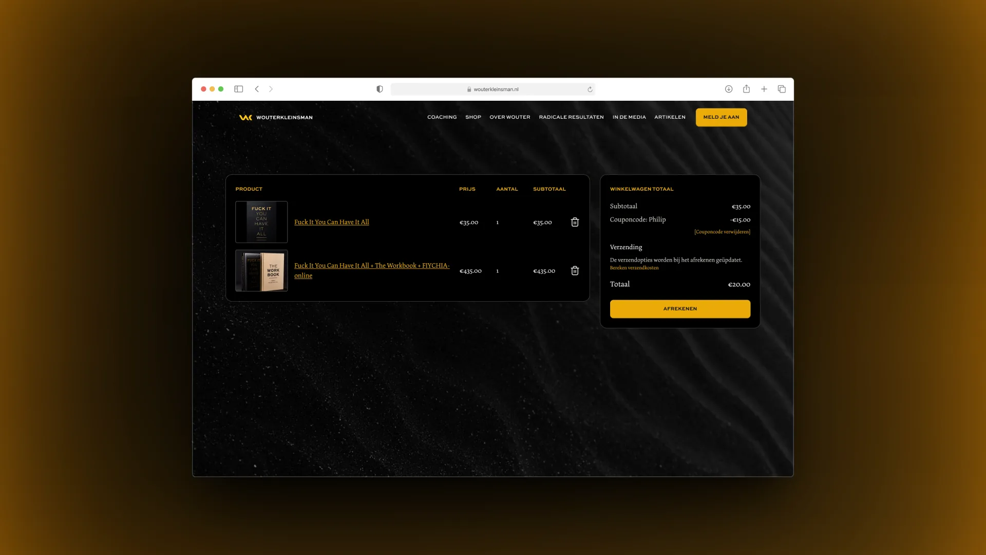
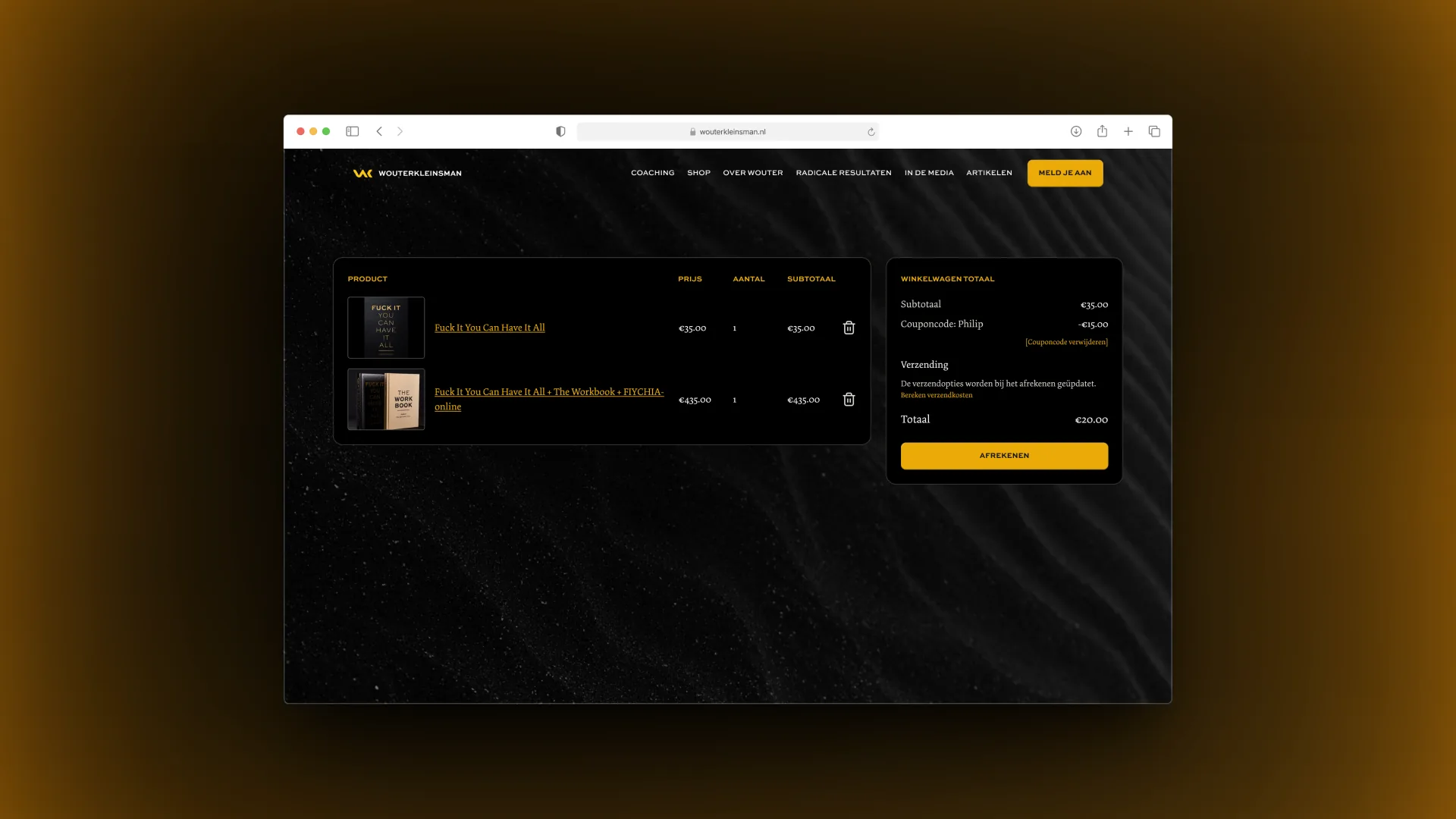
The cart with several items is a table: Product, Prijs, Aantal, Subtotaal, and a delete icon on each row. Next to it sits a panel with “Winkelwagen totaal”: the subtotal, the coupon line with a “Couponcode verwijderen” link, a shipping note and the total. One yellow button, “Afrekenen”, on a dark background.
The coupon code has two places in the design. The first is in that side panel. The second is a traditional coupon field for the cases where it cannot go in the panel. The file names it as the fallback for when it can’t go in the panel.
The checkout
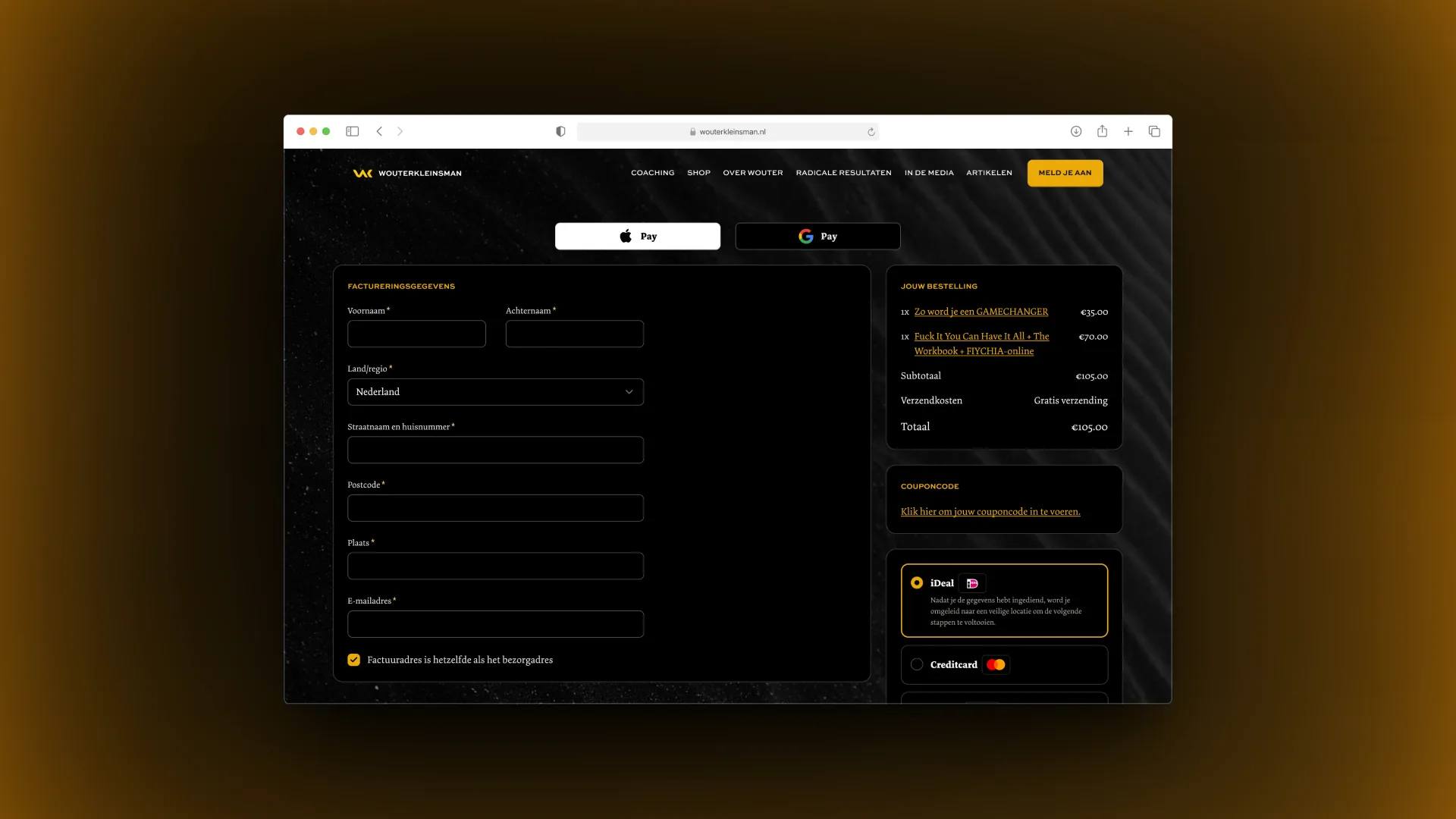
The checkout has two versions in the file. iDeal is the default. The second version opens the credit card fields: card number, expiry and CVC.
On mobile the order is short. At the top are Apple Pay and Google Pay buttons. Below them the billing details: first name, last name, country or region, street and house number, postcode, town and email address. A checkbox reuses the billing address for delivery. Then “Jouw bestelling” with the summary and “Gratis verzending”, a coupon link, and the payment options iDeal, Creditcard and Klarna. The last button reads “Bestelling plaatsen”.
I designed the mobile cart and checkout in seven states, including one with the coupon code block.
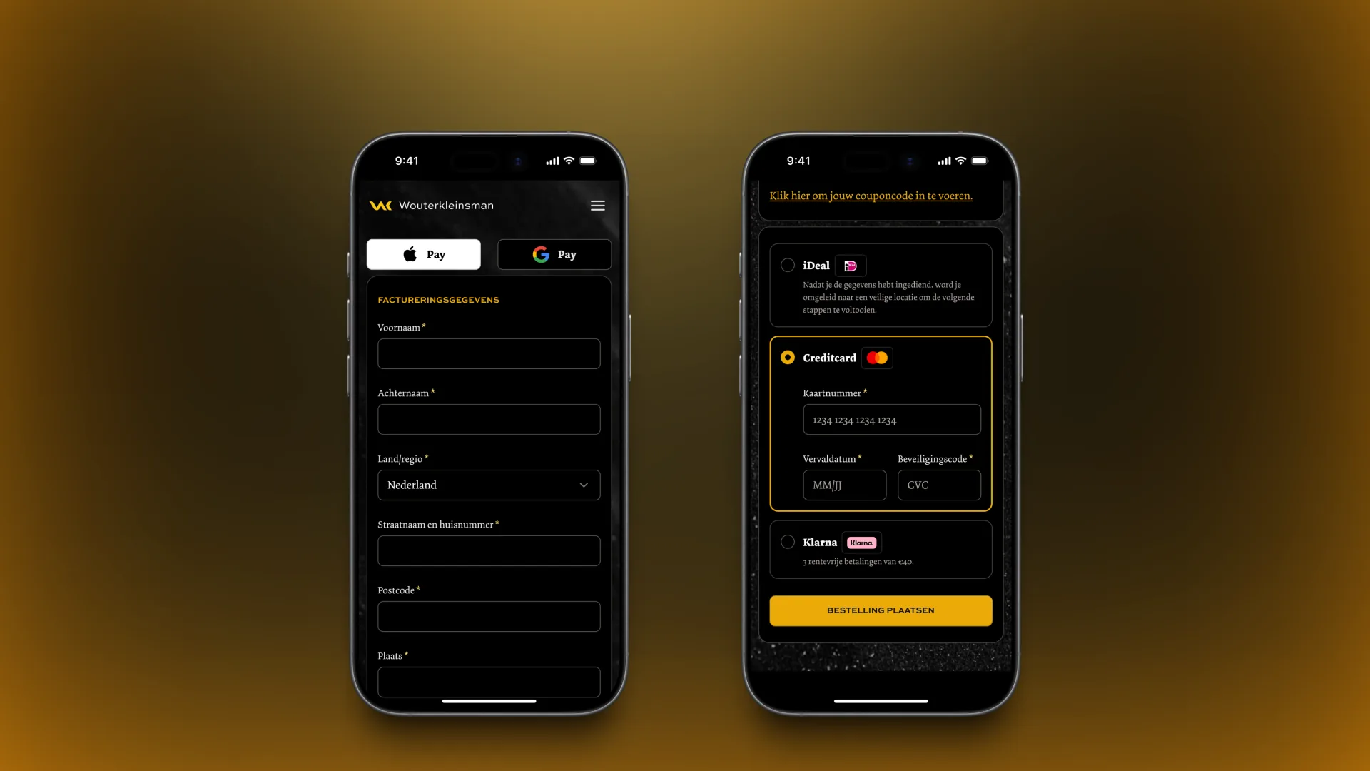
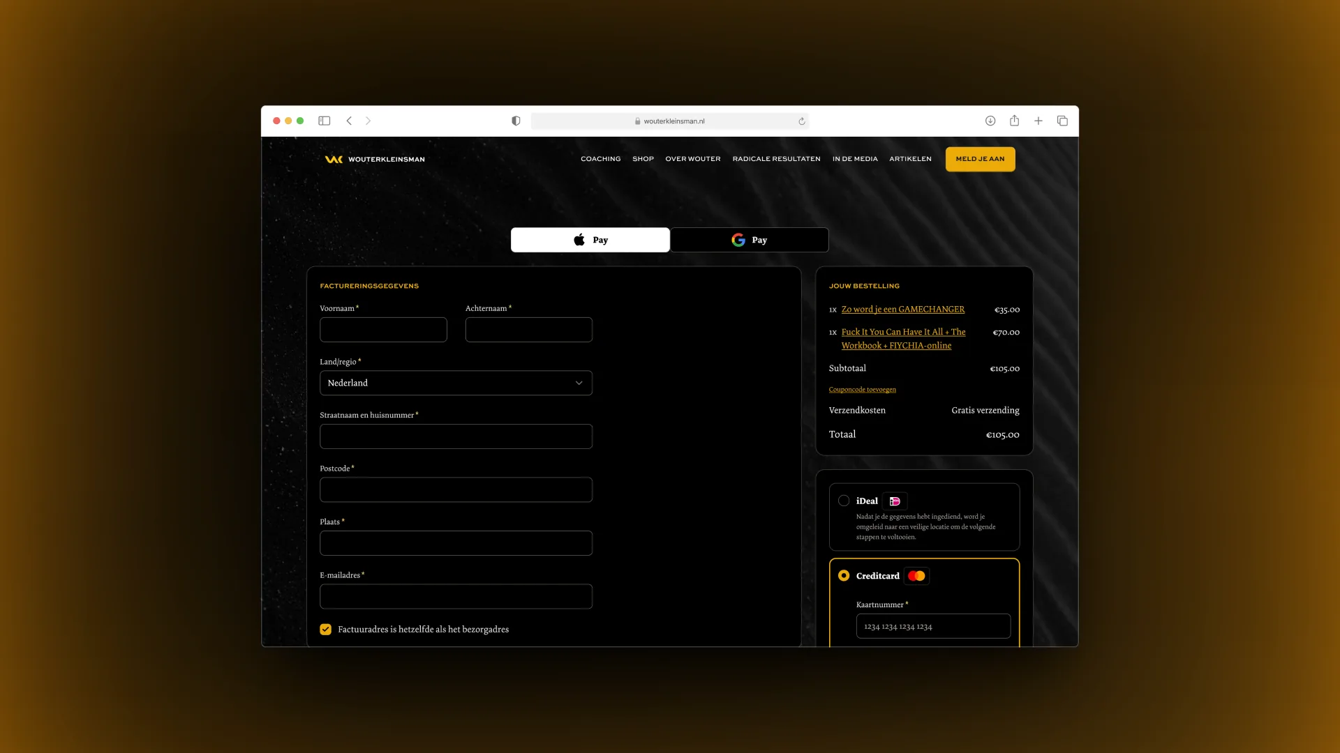
I also posted the design on Layers as “Branded WooCommerce Checkout”. My note there says it plainly: the default cart in WooCommerce felt jucky, so here is how it can look.
The website around it
The checkout sits inside a full site design. I designed the website pages as desktop and mobile pairs: home, coaching, product page, information page, testimonials and a modal. I also designed the mobile menu, the blog section, the call-to-action blocks and the footer, plus an email for the book chapters.
The scope also covered a main landing page whose text can change per keyword, an intake form, an article page, an informational SEO page, a Free Resource page for people who bought his book on Bol, and an email sequence for leads. I designed an email template that can be rebuilt in any email tool.
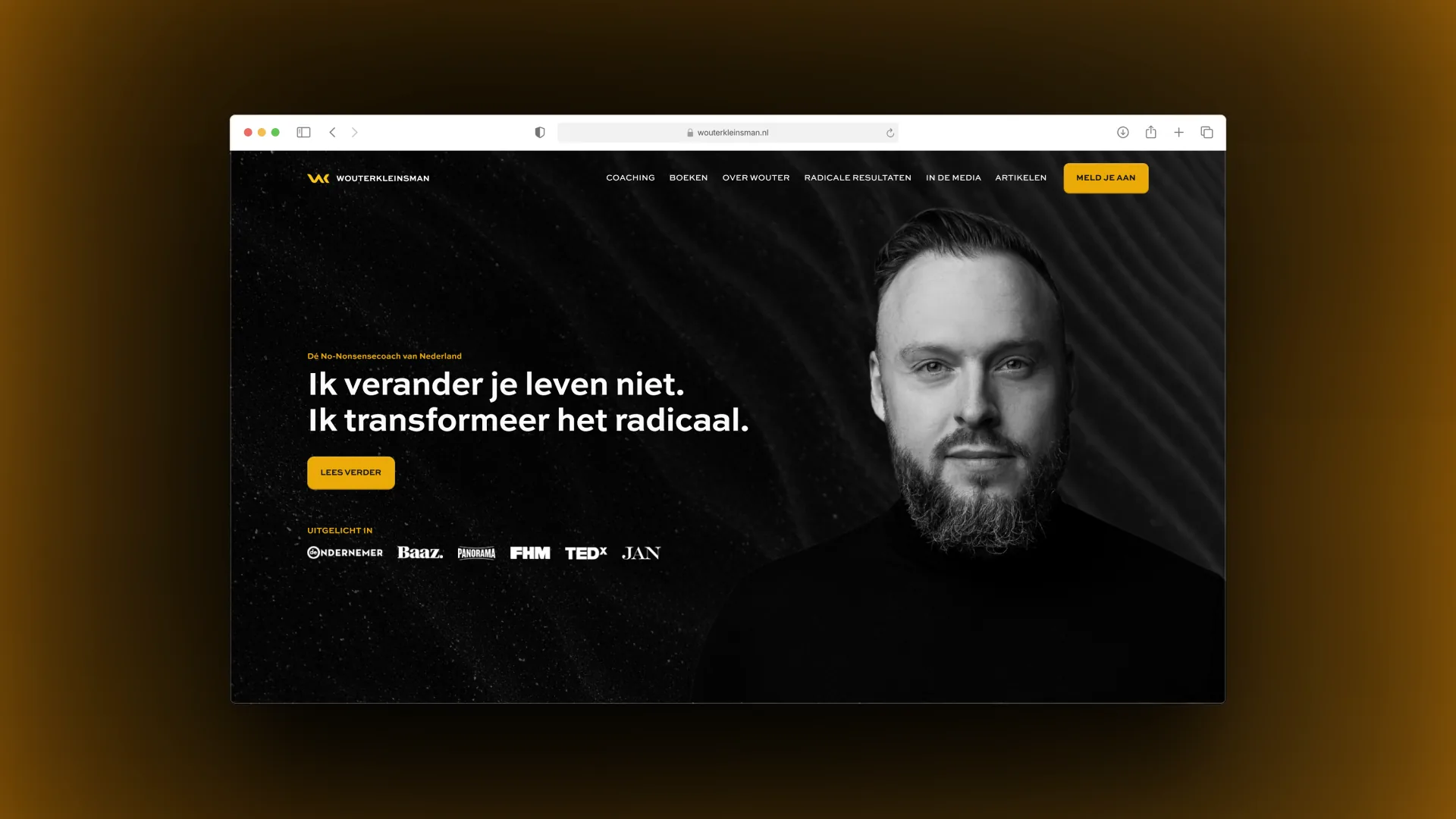
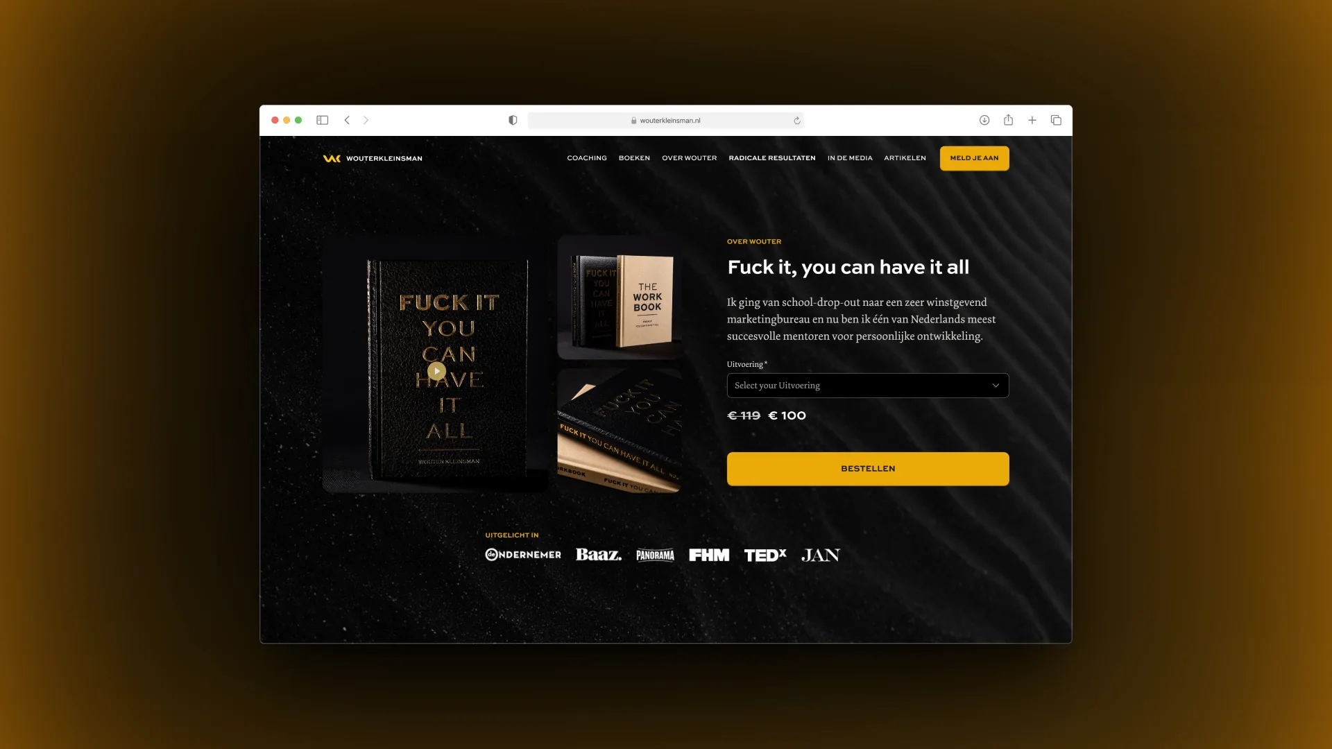
Wouter reviewed the work on video:
“In a few days time he had a concept of a web design. I was like, oh my God, this is freaking amazing. Not only amazing for the eye, but just very well thought through.”
“He’s thinking about every step in the customer journey, how the homepage should be, how the about page, the product page, how that connects with email marketing.”
What this shows
I kept the WooCommerce cart’s feature set and changed how it looks and reads: Dutch labels, one yellow button, and wallet buttons first on mobile.
I drew every state a shopper can land in: empty, undo, coupon, iDeal, credit card and Klarna.