How we helped the Dutch Financial times reach their OKR's by applying Design Thinking
In May 2018 the Dutch Financial Newspaper “Het Financieele Dagblad” achieved an historic achievement when the membership passed 85.000 subscriptions. The Online Subscriptions of the grew with 41.000 readers.
Client
FDMG / Het Financieele Dagblad
Services
The Challenge
Achieve OKR's at the Dutch Financial Times by applying Design Thinking
In 2018 the Dutch Financial Newspaper “Het Financieele Dagblad” achieved a historic achievement when the membership passed 85.000 subscriptions. The Online Subscriptions grew with 41.000 readers.
No items found.
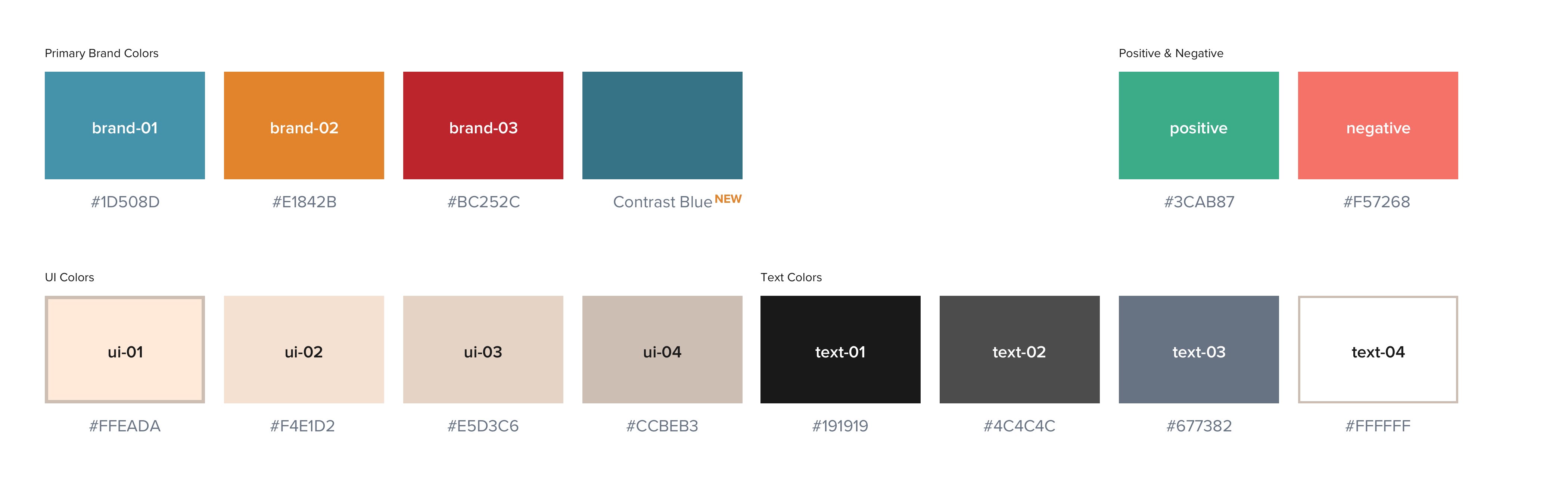
What's inside a Design System?
Colors are never a bad idea. Documenting them is always a simple way to make sure everyone is on the same page. FD is known for its Salmon Pink paper it uses for its newspaper. This is such an essential part of her identity that it’s also a part of her online identity. It took me a little getting used to but by now, I love it.
No items found.
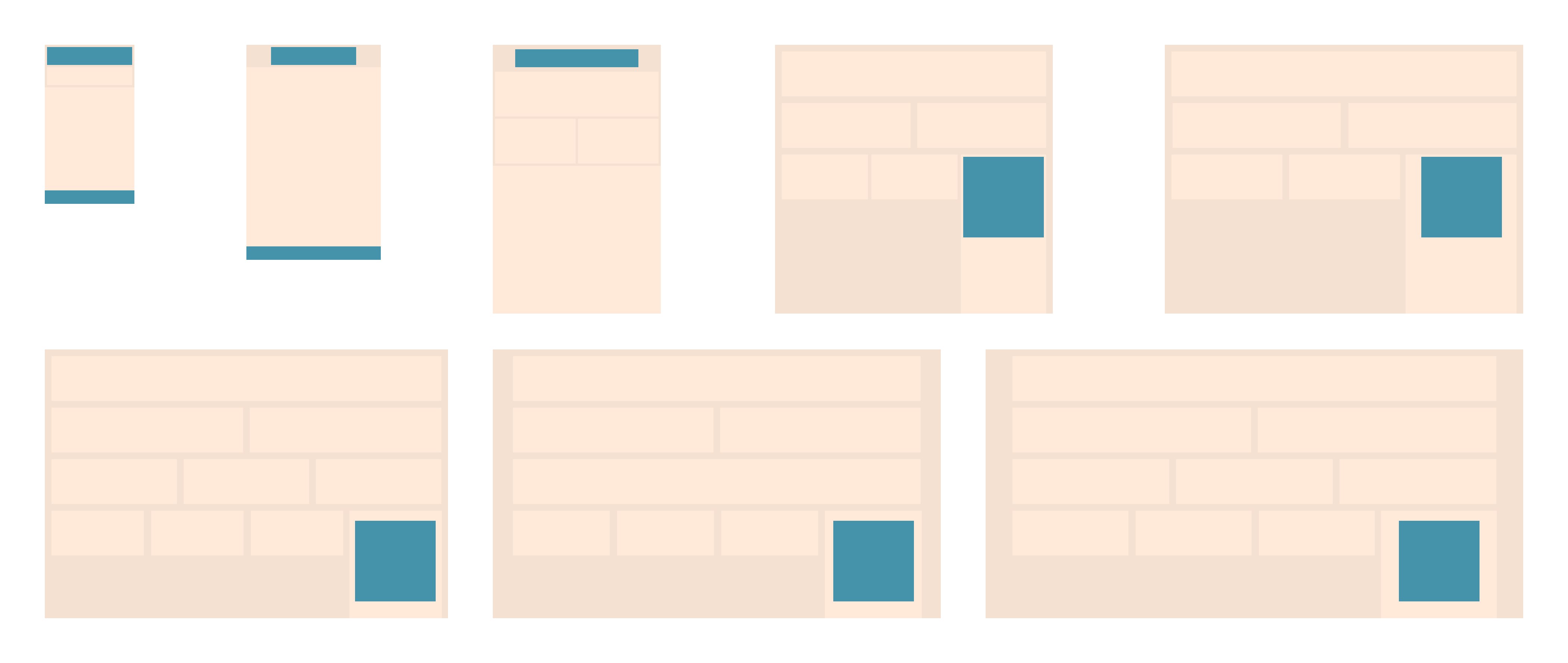
Designing a Custom Grid
After defining the colors, I went on to the next challenge. Besides the revenue from subscriptions, the FD (like many others) are dependant on the income of advertorials. This is realized by also displaying banners The website is responsive. Meaning the layout adapts to the width of the device it’s presented on. Banners on the other hand are fixed sizes and are not allowed to scale. That’s why we needed a custom grid which understands the dimensions of banners. The blue rectangles represent banner sizes. A grid exists of 12 columns. The sidebar on the right sometimes is 1/4th and 1/3rd. In our Custom Grid, we’re able to use the largest banner-size possible.
No items found.
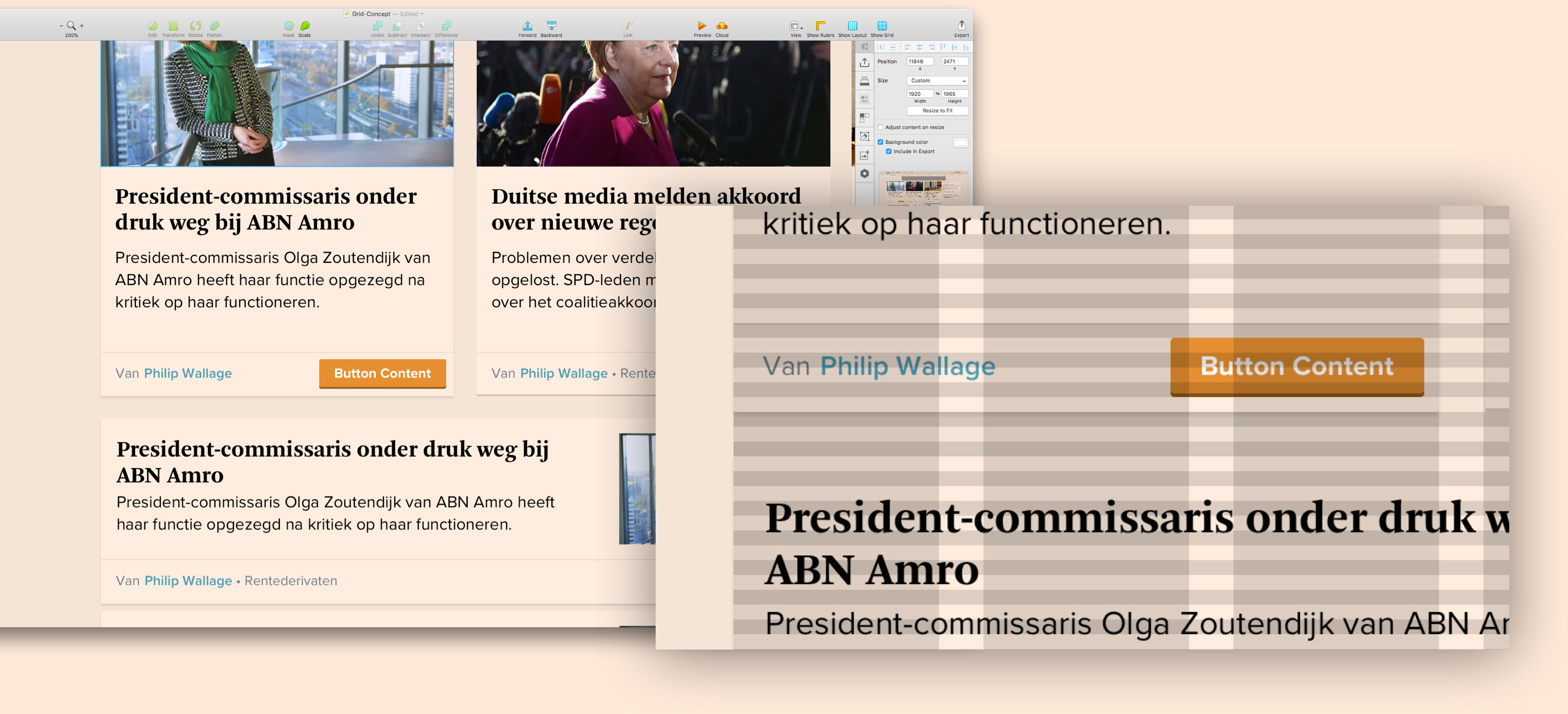
Get in the groove, with vertical rhythm
Readability is extremely important for every website or application. However, do you present extensive articles? Then it only becomes more important! Certainly when you want to present your information as reliable and professional. Not only the font you use has an impact on readability. Line height, letter spacing, contrast, and white space are just as important. By using an 8pt grid, you ensure that a balanced vertical rhythm is created. An 8pt grid is not just for distances around elements. For example, by implementing it in line-height, distances within elements such as buttons, it becomes easy to align texts. As in the example below.
No items found.
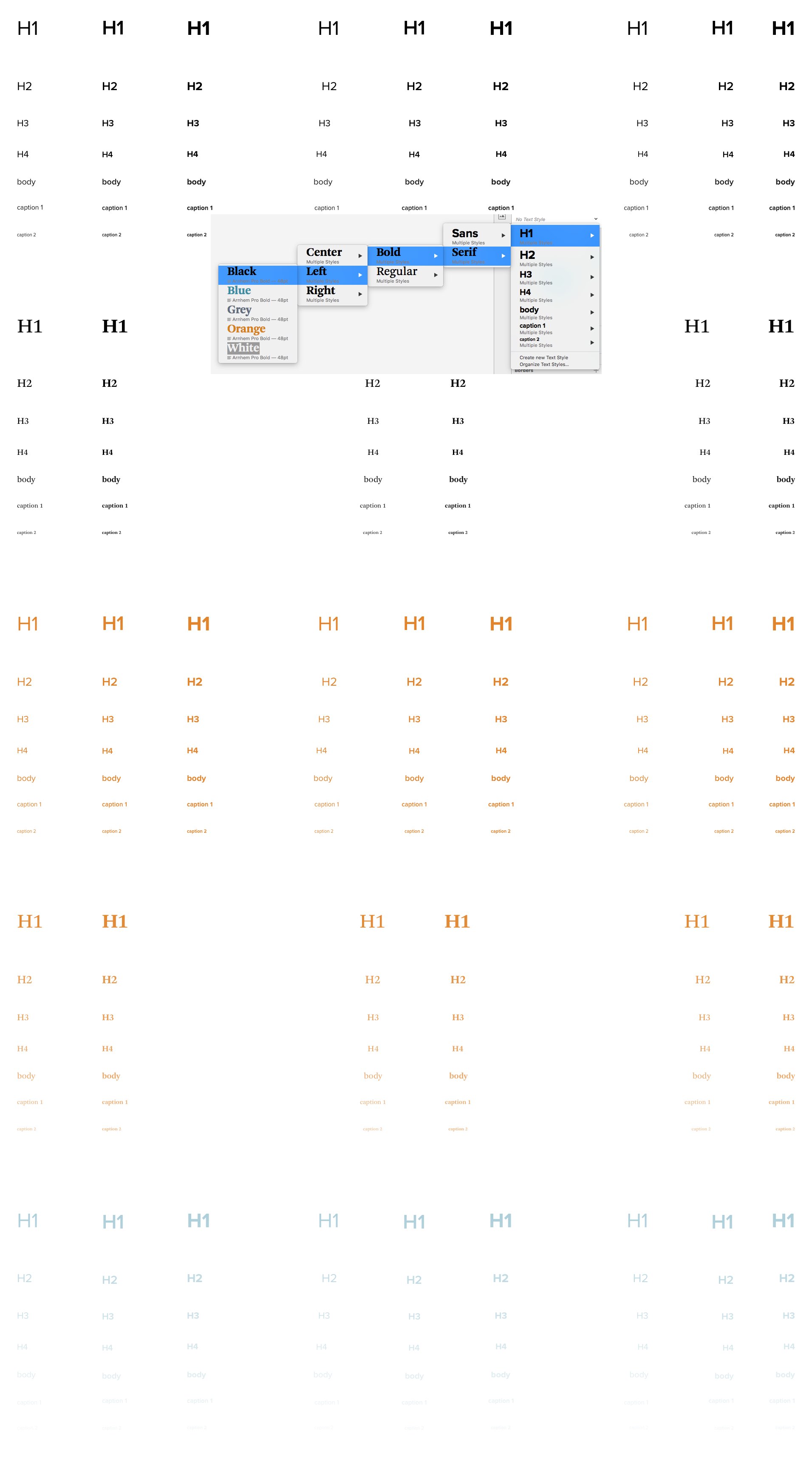
Bringing structure to Typography
The “Financieele Dagblad” uses both Serif and Sans Serif fonts. In our Design System, I added hierarchy and standardization within our font use. Meaning in Sketch, you’ll only have a certain amount of choices with increases consistency and developer happiness.
Bringing structure to Typography
The “Financieele Dagblad” uses both Serif and Sans Serif fonts. In our Design System, I added hierarchy and standardization within our font use. Meaning in Sketch, you’ll only have a certain amount of choices with increases consistency and developer happiness.
Bringing structure to Typography
The “Financieele Dagblad” uses both Serif and Sans Serif fonts. In our Design System, I added hierarchy and standardization within our font use. Meaning in Sketch, you’ll only have a certain amount of choices with increases consistency and developer happiness.
Bringing structure to Typography
The “Financieele Dagblad” uses both Serif and Sans Serif fonts. In our Design System, I added hierarchy and standardization within our font use. Meaning in Sketch, you’ll only have a certain amount of choices with increases consistency and developer happiness.
No items found.
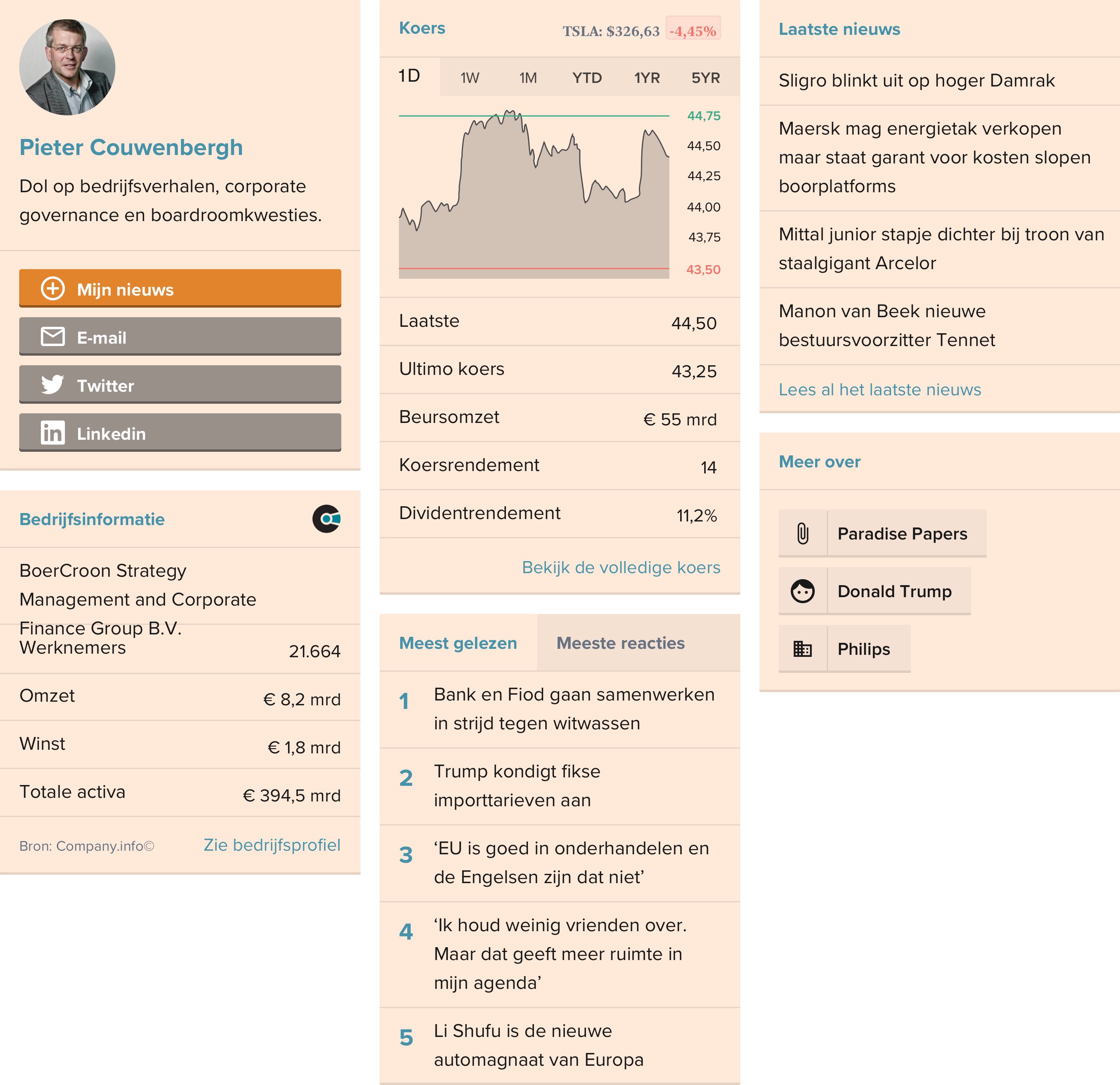
Redesigning Widgets
It’s great when you’ve set the rules to even the playing field. But that’s when you discover you’ve got more work ahead of you. When you create the rules, you should lead by example. Thus I redesigned the sidebar widgets. New typography, abiding the rules of an 8pt grid and suitable to use in our new custom 12 column grid. There were more. So many more!
No items found.
Impact
Consistent effort + time = results
That print media had a rough time, is no news. That’s why it was extra exciting to raise the paywall. The question was if we would lose readers because of this. Which it did not. Ever since 2012, digital memberships have grown with 60%. In 2020 the OKR of growing to +100.000 paid subscribers was successfully achieved.