· 14 min read
Trust Signals That Reduce Checkout Abandonment
SSL badges don't reduce checkout abandonment. These do. A data-driven breakdown of which trust signals actually work at checkout — and which ones are cargo cult.
Ecommerce Conversion
70% of ecommerce carts get abandoned. You’ve probably read that stat ten times. What you’ve read less often is why — and what actually fixes it.
What Is Cart Abandonment in Ecommerce?
Cart abandonment is when a shopper adds a product to their online cart but leaves without completing the purchase. It happens at every stage: on the product page before cart, in the cart itself, and during checkout. For this article, I focus on checkout abandonment specifically — the moment a customer has started the purchase process and stops before paying.
Cart abandonment is not a failure signal on its own. Some abandonment is structural: price comparison, session interruptions, saving items for later. The portion you can recover with better trust signals, clearer pricing, and friction reduction is typically 15-35% of total abandoned carts.

70% of shoppers abandon cart. The other 30% probably still thought about it.
What Is the Average Cart Abandonment Rate for Ecommerce?
The average ecommerce cart abandonment rate is 70.19% (Baymard Institute, 2024 aggregate across 44+ studies). That means roughly 7 in every 10 shoppers who add something to cart don’t complete the purchase.
By device, the breakdown is stark: mobile cart abandonment runs at 85.65% versus 73.07% on desktop. Tablet sits in between at 80.74%. The mobile gap is largely a checkout friction problem — longer forms, redirect payment flows, and harder-to-tap buttons all compound on small screens.
By category: luxury and jewelry see the highest abandonment at 82.84%. Food and beverage the lowest at 63.62%. Most other categories cluster between 70-81%.
What Are Trust Signals in Ecommerce?
Trust signals are on-page elements that reduce purchase anxiety and increase buyer confidence. They answer the question every first-time buyer is silently asking: “Is it safe to give this site my card details, and will I actually get what I paid for?”
Common trust signals include: security badges, payment method logos, return policy statements, delivery date estimates, customer reviews, money-back guarantees, and contact information. Not all of them work equally well. Most stores over-invest in security theater (generic SSL badges) and under-invest in the signals that actually drive checkout completion (transparent pricing, specific delivery dates, clear return terms).
Most stores respond by adding trust badges. McAfee seal in the footer. SSL padlock graphic near the payment button. “Secure Checkout” in bold at the top. And then they’re surprised when cart abandonment doesn’t budge.
Here’s the problem: checkout anxiety is not the same as distrust. Customers who abandon at checkout are not thinking “this site will steal my card.” They’re thinking “I have no idea when this arrives,” “what if it doesn’t fit,” and “I’m seeing a different price than on the product page.”
Those concerns require specific answers. Security badges provide none of them.
Baymard Institute has run more than 44,000 hours of UX testing across ecommerce checkout flows. Their data is clear: the biggest checkout abandonment drivers are unexpected costs (48%), forced account creation (24%), and opaque delivery timing (22%). Security concerns rank lower — and yet most stores optimize almost exclusively for security theater.
This article breaks down which trust signals actually move the needle at checkout, which ones are cargo cult, and how to test what’s working in your specific store.
Why Checkout Trust Is Different From Product-Page Trust
On a product page, you’re helping someone decide if they want something. Trust at that stage is about credibility — does this brand know what it’s talking about? Are these reviews real? Is the product quality as described?
By checkout, the customer has already decided they want it. The anxiety shifts entirely. Now they’re asking: is this transaction safe to complete? Will I get what I expect? What happens if something goes wrong?
That’s a fundamentally different psychological state. And it requires fundamentally different trust signals.
A customer on your product page benefits from testimonials, brand story, certifications, and social proof. A customer at checkout needs three things, in this order:
- Confirmation they’re getting exactly what they chose at the price they agreed to
- Certainty about when it arrives and what happens if it doesn’t
- A safety net — a clear answer to “what if I need to return this?”
Everything else is secondary. That’s not a guess. That’s what Baymard’s 44,000 hours of testing say.

Not all trust signals are equal. Some convert. Some just look nice in the footer.
The Trust Signals That Actually Work
Return Policy: Language Matters More Than Policy
“Free returns” is not a trust signal. It’s a claim. Customers have been burned enough times that a two-word phrase doesn’t move them.
This moves them: “No-questions-asked 30-day returns. Free prepaid label emailed within minutes of your request.”
That sentence does four things. It defines the window (30 days). It eliminates friction (“no questions asked”). It makes the return process concrete (“prepaid label”). And it makes it fast (“within minutes”). Each of those details removes a specific fear.
The impulse when you have a restrictive return policy is to hide it. That’s the wrong move. Customers who discover a bad return policy after buying leave negative reviews and don’t come back. Customers who see it clearly before buying either accept the terms or don’t buy — but they don’t feel deceived. Your repeat purchase rate depends on the latter group.
Put the return policy at checkout, near the payment button, in plain English. Not a link to a returns page. The actual terms in 25 words or fewer.
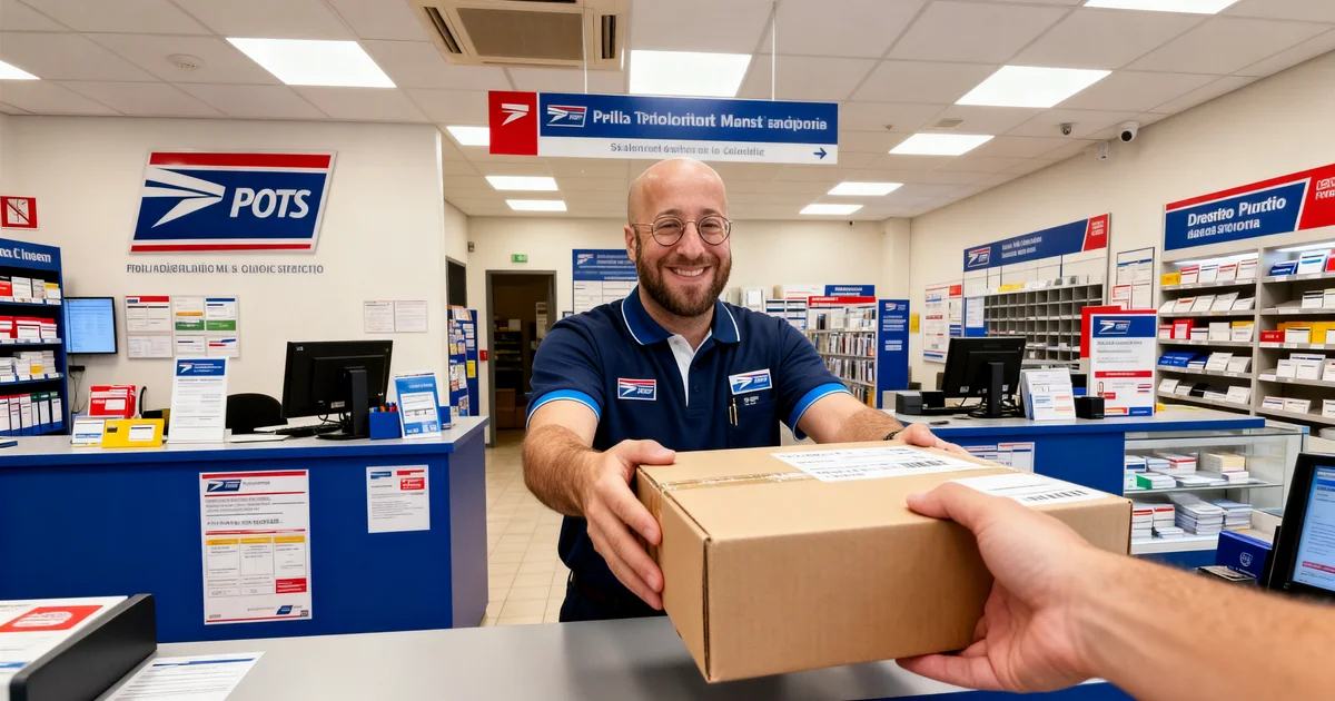
Shipping: Specific Date, Not a Window
“3-5 business days” is not useful. It’s a hedge.
“Arrives by Thursday, March 12” converts. It answers the actual question: will this be here for the weekend? For the birthday? Before I leave for the trip?
Amazon built this into its core experience. Every item has a specific date, dynamically calculated based on your location, their warehouse, and the carrier’s transit time. That specificity is a conversion driver — not a nice-to-have.
Baymard’s research shows that delivery date uncertainty is one of the top five checkout abandonment triggers. A delivery window partially solves this. A specific delivery date solves it properly.
If your fulfillment system can’t calculate exact dates yet, get as specific as you can. “Ships today before 3PM. Expected arrival: March 12-13.” That’s already substantially better than a 3-5 day window.
One more thing: show shipping cost before checkout. Every extra euro that appears at the payment step that wasn’t visible earlier is a conversion killer. In Baymard’s data, 48% of checkout abandonments cite unexpected costs as the reason. Show shipping cost on the product page. Show it in the cart. Show it at checkout. Repeat it three times so there are zero surprises.
Contact Availability: Being Reachable Is a Trust Signal
A checkout page with no visible contact information signals one thing: no one to call if something goes wrong.
For first-time buyers, this is a deal-breaker. They’re about to hand you their card details. They want to know there’s a human on the other end.
Phone number visible at checkout: reduces abandonment, particularly for higher-ticket items. Live chat during business hours: reduces abandonment and increases average order value because customers can ask questions without leaving checkout. Email address or contact form: the minimum viable option.
A 2023 Forrester study found that 53% of online shoppers are more likely to complete a purchase if they can see a phone number. That number climbs to 71% for transactions over €100.
You don’t need 24/7 support. You need visibility. A simple line — “Questions? Call us at +31 20 123 4567 or chat Monday-Friday 9-17” — tells the customer that a real business is behind this checkout.
Security Badges: The Ones That Work vs. the Noise
Not all badges are equal. Most are noise.
The badges that work at checkout fall into two categories:
Payment processor logos from brands customers recognize. Stripe, Mollie, Adyen, PayPal — these carry implicit security trust because customers know these companies process billions of transactions and handle fraud protection at scale. A line like “Payments processed securely by Stripe — we never see or store your card details” outperforms any security certificate badge because it’s specific and explains what actually happens.
Local payment method logos. For Dutch stores: iDEAL. Full stop. iDEAL handles roughly 70% of Dutch online transactions. If an iDEAL logo isn’t prominent at checkout for a Dutch customer, you’re creating uncertainty about whether their preferred payment method is available — at exactly the moment they’re about to pay.
The badges that don’t work: obscure security certification logos (McAfee, Norton, HackerSafe when they’re not recognized), generic “100% Secure” shields with no issuing body, trust seals that open a pop-up when clicked (interrupts checkout flow, generates irritation not confidence).
The padlock in the browser address bar matters. Customers notice when it’s missing. Most don’t consciously notice when it’s present — it’s a threshold signal, not a positive driver. Run HTTPS everywhere. It’s table stakes, not a differentiator.
Social Proof at Checkout: Mostly Distraction
This is a controversial take, but it’s backed by data.
Social proof — testimonials, star ratings, recent purchase notifications — belongs on product pages. At checkout, the customer has already decided they want the product. Showing them testimonials at this stage doesn’t increase confidence. It slows the transaction and introduces decision friction.
“4,892 people bought this last month” might work on a category page to establish popularity. At checkout, it’s noise.
The exception: aggregate trust signals tied directly to the transaction. “Joined 12,000 satisfied customers” near the payment button can work because it’s about the purchase experience, not the product. But test this against your specific audience — for many stores, it adds clutter without conversion benefit.
Recent purchase pop-ups (“Someone in Amsterdam just bought this!”) at checkout are actively harmful. They distract, they feel manipulative to sophisticated shoppers, and they slow down the flow. Kill them at checkout.
Guest Checkout: The Biggest Trust Signal You’re Probably Ignoring
Forcing someone to create an account before they can buy is a distrust signal. It says: “We want your data more than we want your sale.”
Baymard’s data: 24% of customers who abandon checkout do so because the site required account creation. That’s roughly one in four abandoning customers you could recover by adding a guest checkout option.
This is not a trust badge. But it’s one of the highest-impact trust signals available — because trust at checkout is fundamentally about reducing friction and perceived risk. An account creation requirement adds both.
Offer guest checkout. If you want customers to register, ask after the purchase confirmation, when they’re in a positive emotional state and you can frame it as “save your details for next time” rather than a toll to pay for buying.
HTTPS and Visual Security: When Users Notice, When They Don’t
Let me be direct: most customers don’t consciously check for the padlock. But they do notice when it’s missing.
Modern browsers flag HTTP sites with “Not Secure” warnings. That warning actively hurts conversion. HTTPS eliminates the warning — it doesn’t create positive lift on its own.
Where customers do notice security: when the page feels insecure. Broken images. Mismatched fonts. Checkout forms that look different from the rest of the site. An error message that appears and disappears. These visual signals of “something is off” trigger anxiety faster than any security badge can calm it.
Your checkout design needs to feel consistent, polished, and deliberate. The visual language of trust is not primarily about badges — it’s about competence. A checkout that looks like it was designed by professionals signals that the company behind it is professional.
“Free returns” in the header. It costs you less than the cart abandonment it prevents.
EU-Specific Trust Signals That Actually Matter
EU buyers have their own set of trust signals that American-focused ecommerce content consistently ignores. Here’s what actually moves the needle by market.
Netherlands
iDEAL logo — Non-negotiable. 70%+ of Dutch online payments go through iDEAL. Displaying it prominently signals both payment method availability and legitimacy (banks don’t connect just anyone to iDEAL).
Thuiswinkel Waarborg — The Dutch ecommerce quality mark. Recognized by 73% of Dutch online shoppers (Thuiswinkel.org data). If you’re eligible, display it. It signals dispute resolution guarantees and verified business practices. It costs money and requires compliance — which is exactly why consumers trust it.
Kiyoh — Dutch review platform. More trusted than Trustpilot among Dutch shoppers for pure ecommerce stores. A Kiyoh rating widget at checkout with 4.5+ stars and 200+ reviews makes a difference. The key: it needs to be real. Fake reviews kill this faster than no reviews.
Germany
Trusted Shops — The German market’s dominant trust mark. 30 million consumers use Trustmark-certified shops. A Trusted Shops badge with visible rating at checkout is a meaningful signal for German buyers specifically.
Käuferschutz (buyer protection) — The Trusted Shops buyer protection guarantee is explicitly valued by German customers. Displaying the protection amount (“Geschützt bis zu €20.000”) addresses the risk-anxiety that German buyers in particular respond to.
Belgium, France, other EU markets
SSL + recognizable payment brands — Visa, Mastercard, PayPal, and Bancontact (Belgium) carry more trust than local certification marks in these markets. Focus on payment method visibility and a clean HTTPS checkout.
Language match — Serving a French-speaking customer in English during checkout is a trust erosion. Match checkout language to customer locale. This sounds obvious. A surprisingly large number of EU stores get it wrong.
The Trust Leak: When Your Pages Disagree
Here’s a checkout abandonment cause that doesn’t show up in most trust signal articles: inconsistency between pages.
Customer sees a product for €49 with “free shipping.” Adds to cart. Cart shows €49. Reaches checkout. Suddenly: €49 + €5.95 shipping. The “free shipping” was for orders over €75.
That customer doesn’t just abandon. They leave with a feeling of deception that prevents future visits.
The trust leak happens when:
- Price on product page differs from cart or checkout price (promotions, currency conversion, rounding)
- Shipping terms stated on product page contradict checkout calculation
- Return policy in the FAQ differs from what’s shown at checkout
- Estimated delivery on product page is different from delivery date shown at checkout
These inconsistencies signal one of two things to the customer: either the store is incompetent, or it’s deliberately misleading. Either way, they leave.
Audit your checkout for trust leaks quarterly. Check: does the price the customer sees at step 1 of checkout exactly match what they saw on the product page? Does the shipping cost match what was shown in the cart? Does the return policy at checkout match your FAQ?
Every inconsistency is a conversion killer.
How to Fix Checkout Abandonment: The 10-Step Trust Hierarchy
Apply these in priority order. Don’t skip to step 7 before fixing step 1.
- Transparent total pricing before checkout. No surprise costs. Shipping shown on product page and confirmed at every checkout step.
- Specific delivery date in cart and at checkout. Not a window — a date.
- Clear return policy near the payment button. 25 words. Plain English. Specific terms.
- Guest checkout option. Remove the account creation wall.
- Local payment methods prominently displayed. iDEAL for NL. Bancontact for BE. The actual methods your customers use.
- Contact information visible at checkout. Phone, chat, or email. Something.
- Plain-language security statement. “Payments processed by Stripe. We never see your card details.”
- Local trust marks for your market. Thuiswinkel for NL. Trusted Shops for DE.
- Guarantee statement near the payment button.
- Product images in the order summary.
Items 1-4 drive the majority of the conversion lift. Items 5-10 add incremental improvement. Don’t skip the first four to install the last six.

You added 6 security badges. Conversions didn’t move. This section explains why.
What Doesn’t Work (Stop Wasting Time on This)
Generic “Secure Checkout” headers. Every checkout page has one. Customers have become blind to them.
Footer trust badges. No one reads the footer during checkout. If it’s only in the footer, it doesn’t exist.
Testimonials at checkout. They’ve already decided to buy. Social proof at this stage adds clutter and decision fatigue.
Pop-up trust overlays. Interrupting checkout to show a security certificate generates irritation. The customer is trying to give you money. Let them.
Logos of certifications customers haven’t heard of. An ISO 27001 badge means nothing to the average shopper. A Stripe logo means a lot.
Vague guarantee language. “We stand behind our products” is not a guarantee. “Full refund within 30 days, no questions asked” is.
Recent purchase notifications at checkout. Manipulative to savvy shoppers. Distracting to all shoppers. Cut it.
Testing Trust Signals: How to Know What’s Working
Installing trust signals without testing is guesswork. Here’s how to actually know what’s working.
Start with heatmaps and session recordings. Tools like Hotjar or Microsoft Clarity show where customers stop, where they hesitate, and where they leave. If customers hover near the shipping cost field before abandoning, you have a shipping transparency problem. If they scroll back up after seeing the payment form, they’re looking for something — probably return policy or contact info.
Run exit surveys at checkout. A single question (“What stopped you from completing your order today?”) on the exit-intent popup gives you direct signal. Answers about return policy, delivery time, or payment security tell you exactly which trust signal to fix first.
A/B test one element at a time. Add specific delivery dates to your checkout. Run it for two weeks against your control. Measure checkout completion rate. Don’t add five trust signals simultaneously — you won’t know which one moved the needle.
The metrics that matter:
- Checkout initiation to completion rate (aim for 60%+ for optimized checkouts; average is ~45%)
- Step-level abandonment (which specific checkout step loses the most customers?)
- Mobile vs. desktop checkout completion (mobile is typically 15-20% lower — often a trust signal display problem)
Segment your analysis. New visitors have different trust signal needs than returning customers. First-time buyers need more reassurance — particularly around returns and contact availability. Returning customers are already trust-calibrated; they just need a fast, frictionless path to completion.
One specific test worth running: add a phone number to your checkout and track the impact on completion rate. For most stores selling products above €50, it drives meaningful improvement. The phone rarely rings — but the number being visible is what matters.
The Numbers You Should Know
Before adding another trust badge, benchmark against these:
- Average ecommerce checkout abandonment rate: 70% (Baymard, 2024)
- Top reason for abandonment: Unexpected costs at checkout — 48% of abandoners
- Impact of forced account creation: 24% of abandoners cite it as the reason
- Delivery uncertainty: 22% of abandoners say unclear delivery timing was a factor
- Mobile checkout completion: ~15-20% lower than desktop for most stores
- Impact of visible phone number on conversion (>€100 transactions): +71% likelihood to complete (Forrester)
- iDEAL share of Dutch online payments: ~70%
- Thuiswinkel Waarborg recognition among Dutch shoppers: 73%
- Trusted Shops active users: 30 million across Europe
These numbers tell you where to put your effort. Unexpected costs and forced account creation are your two biggest abandonment drivers. Fix those before optimizing anything else.
Where to Start This Week
Pick one thing from this list and implement it before the end of the week:
- If you’re showing shipping costs at checkout step 3 or later: Move them to the product page. Today.
- If you’re requiring account creation: Add guest checkout. Your dev team can do this in a day.
- If your return policy is buried in a footer link: Add a 25-word plain-English version near your payment button.
- If you’re showing “3-5 business days”: Replace it with a specific date or tightest possible range.
- If you have no contact info visible at checkout: Add a phone number or live chat link.
Every one of these is a higher-leverage move than adding another trust badge.
The full checkout optimization guide covers checkout friction beyond trust signals. And cart abandonment fixes addresses what causes customers to leave before they even reach checkout.
What to read next
Trust at checkout is one layer. The full checkout experience determines whether customers complete the purchase.
- The €50,000 Ecommerce Mistakes — free guide covering the trust signal mistakes that increase checkout abandonment
- Top 12 Checkout Optimization Tips — checkout friction beyond trust: form fields, guest checkout, express payment, mobile
- Cart Abandonment Fixes — what causes abandonment before checkout and what specifically resolves it
- Shopify Abandoned Cart Discount: Best Practices — when to use a discount to recover lost carts, and how to set it up without training shoppers to abandon on purpose
- Product Page Elements That Increase Sales — trust signals belong on product pages too, placed at the right moments
High cart abandonment and not sure where the problem is? My UX research service identifies the specific friction points in your checkout flow.
