Ecommerce Design • 2025 • DeOnlineDrogist
Spring cleaning De Online Drogist backed by Research
De Online Drogist is one of the largest e-commerce platforms in the Netherlands. Despite their scale and success, their digital experience was cluttered, inconsistent, and weighed down by years of UX debt. When I first opened the site, I couldn’t believe my eyes. So much low-hanging fruit. So many quick wins. The best part? They were already performing well, which meant there was nothing but upside. That’s where I came in.
Figma UX Design
Scope & Setup
Through my BTNG Unlimited subscription, I worked closely with their in-house team. Weekly check-ins. Ongoing Figma access. Comments flowing in real-time. It was a fluid setup designed for fast iteration and sharp focus.
The first step was a full UX audit based on Baymard Institute guidelines. It confirmed what they already suspected and gave us the structure to fix it. Quickly. Properly.
Design Highlights
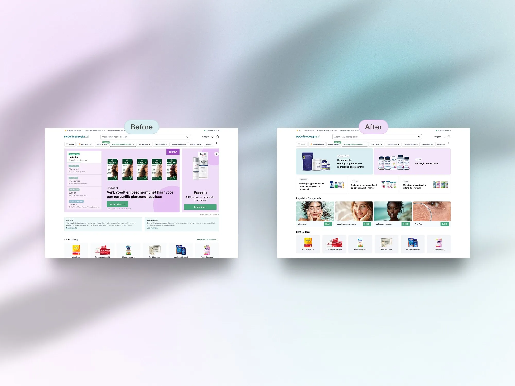
Homepage: Kill the Carousel
The old homepage had a slider. You know the kind:
- Auto-rotates every few seconds
- No pause on hover
- No manual controls
- Most users never even saw slide three
According to Baymard #242D, this is a classic UX fail.
We replaced it with static banners. Always visible. Always relevant. No waiting. No distractions.
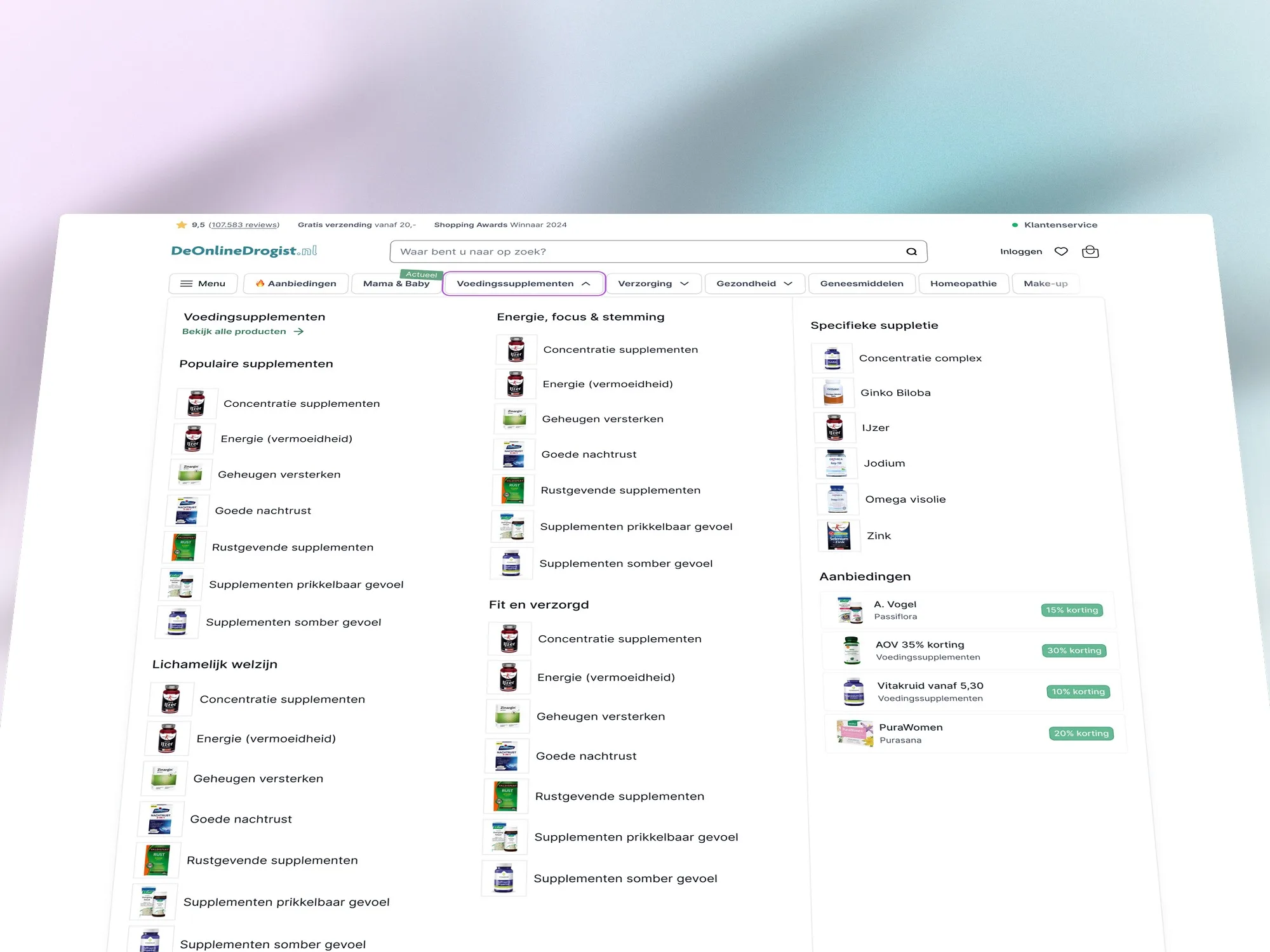
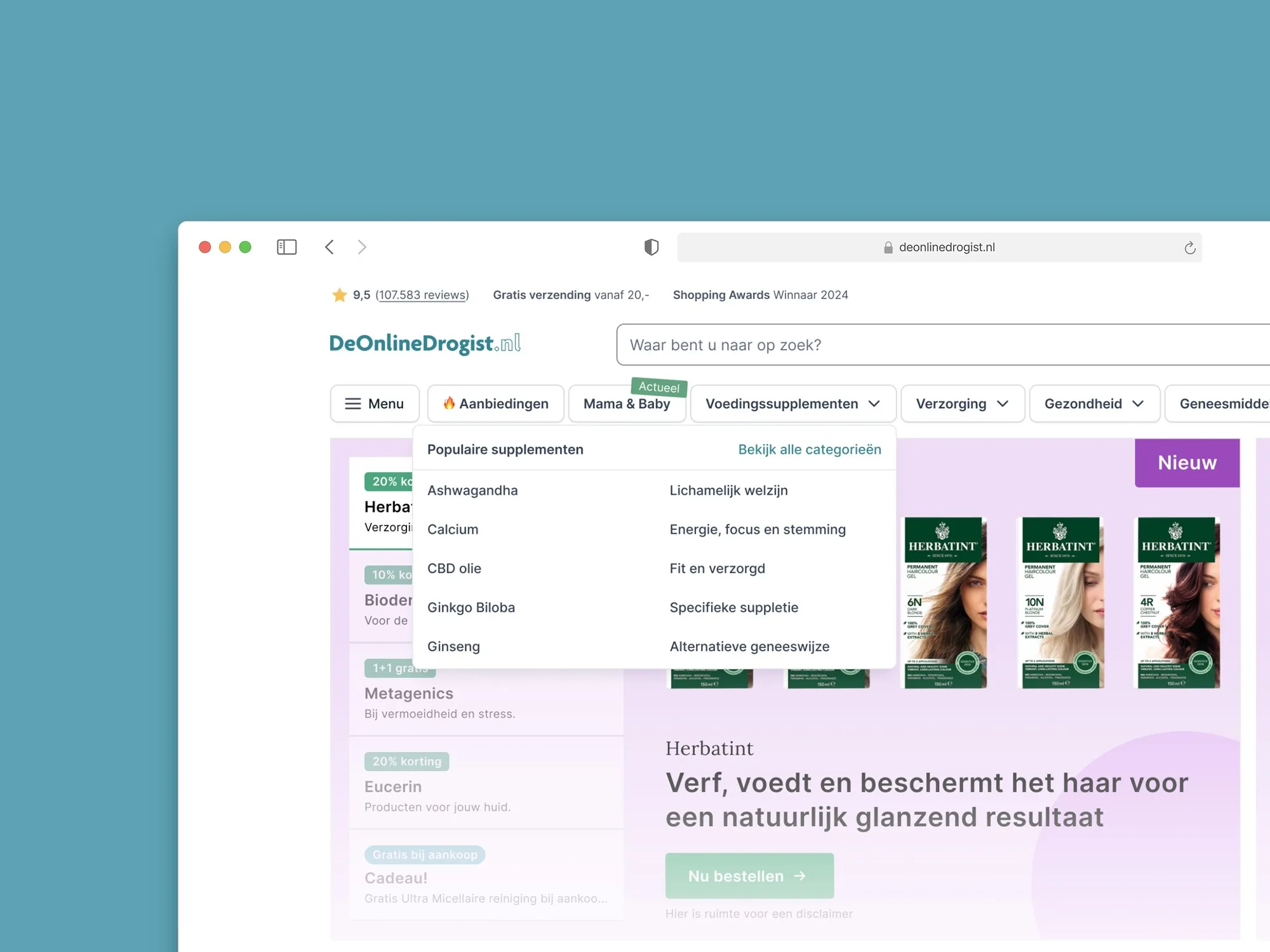
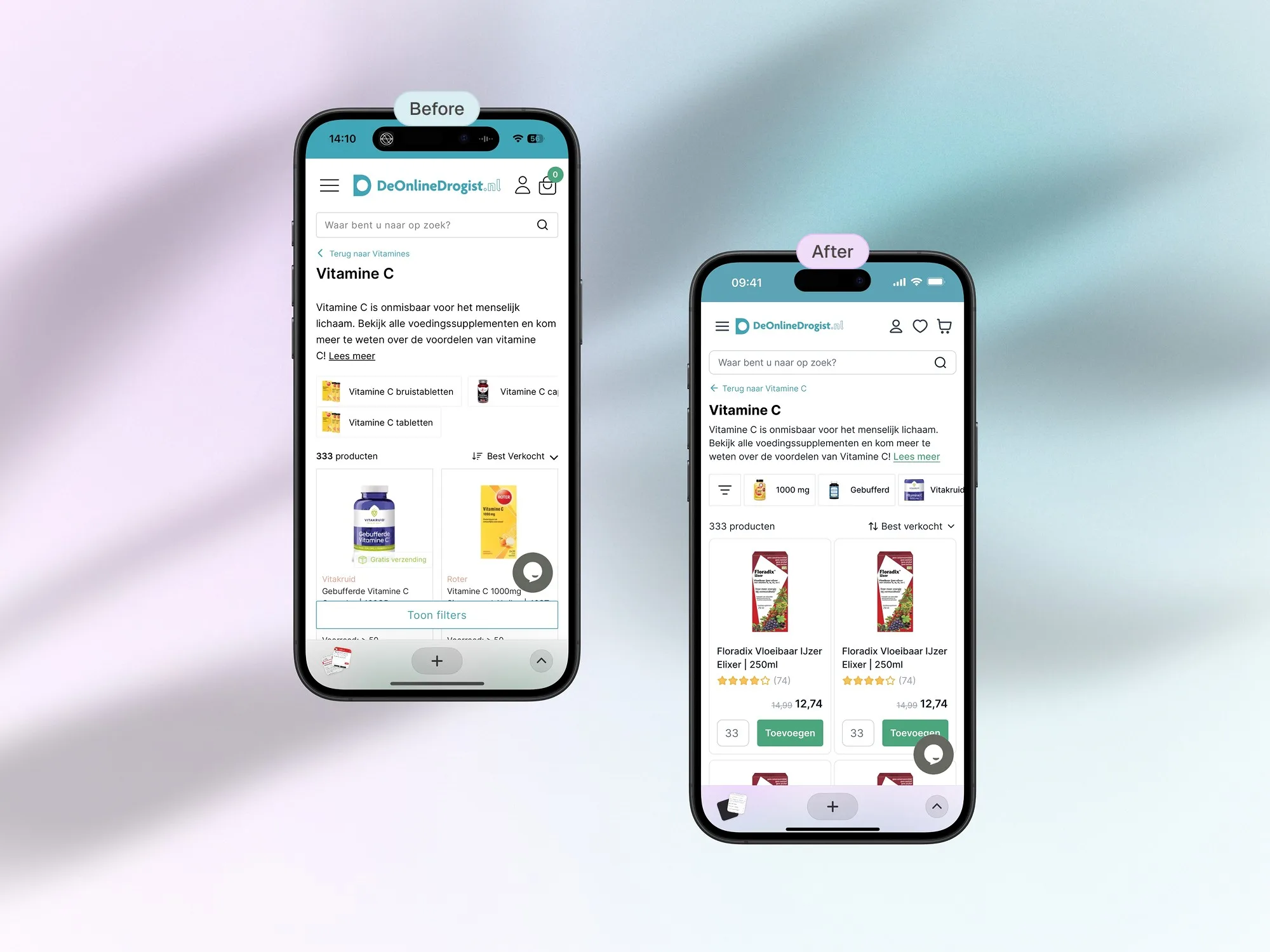
The Navigation realisation that changed everything
One of the biggest breakthroughs came when we redefined the difference between a main and sub-category.
The old nav mashed everything together.
Our redesign added clarity, depth, and control:
- Mega menu with dedicated zones for promotions, top categories, and deals
- Clickable headers (Baymard #266D)
- Filter logic cleaned up (Baymard #253D, #261D)
- Clear visual hierarchy (Baymard #263D)
Users can now scan, browse, or dive deep without ever feeling lost.
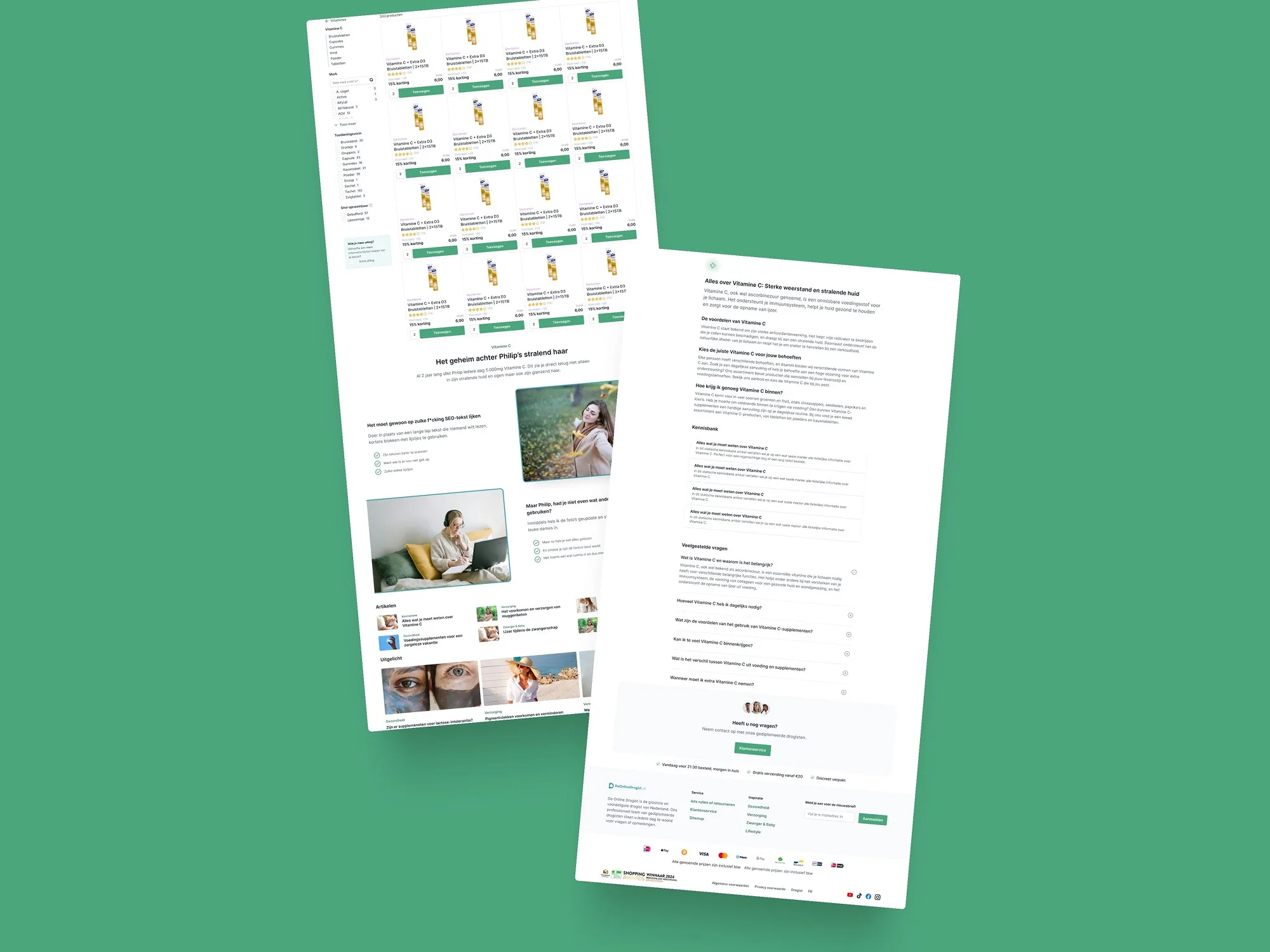
Sub-Category Page: Smarter Filters, SEO Juice and Product Highlights
This section was overdue for an upgrade:
- Introduced tooltips to explain filters
- Allowed banners inside the product listing
- Added modular content blocks for SEO like FAQs, featured products, and related articles
- Optimised spacing and layout, especially on mobile
Side-by-side, the difference is clear. The old design was chaotic. The new one is calm, focused, and more shoppable.
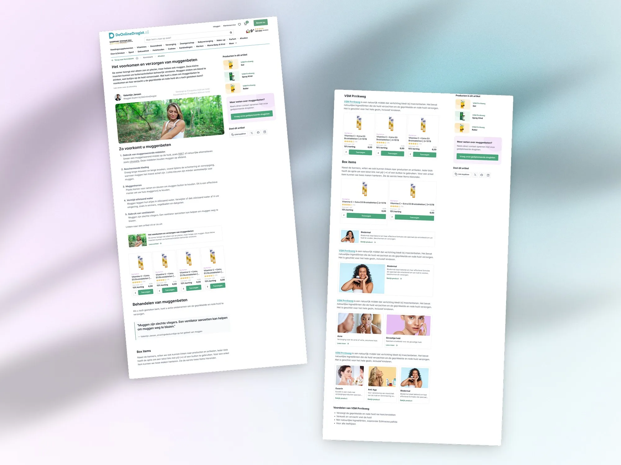
Blog Article Layout: Content Meets Commerce
We redesigned the article template to do more than just look good.
Now, whenever a product is mentioned, it shows up directly in the sidebar:
- On desktop, the sidebar is sticky and always visible
- Products are contextually linked with the content
- Modular layout allows for rich formatting, tips, and cross-links
It’s a seamless bridge between content and commerce.
Design System: Less Noise, More Flow
There was already a brand in place. That helped. But the execution lacked consistency.
So I gave the entire UI a polish pass:
- Unified spacing, sizing, and padding
- Modular cards and floating layouts
- Consistent styles across banners, forms, and product displays
Not flashy. But foundational. And in a platform this size, consistency builds trust.
Mobile: More Products, Less Scroll Fatigue
The mobile sub-category pages had spacing issues. You had to scroll a lot just to see more than one or two products.
I cleaned that up:
- Sharper layout
- Tighter filters
- More products above the fold
- Smoother experience from first tap to checkout
Reflection
This wasn’t a rebrand or a total rebuild. It was a long-overdue spring cleaning. Grounded in usability best practices, applied with surgical precision.
The result is a more polished experience. Cleaner. Clearer. Easier to navigate. No dramatic redesign. Just a smart, steady evolution that finally reflects the scale and professionalism of the business.
Project Gallery
Back to cases
Want results like this for your store?
Book a call